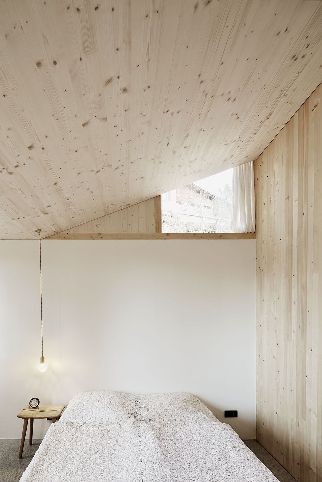
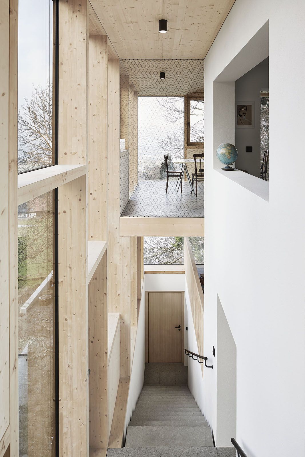
This is such a nice way of introducing a bit of light. The part of the wall where the window is could have been easily covered up. Instead it’s been left open to create a small window. I think this is such a great idea.
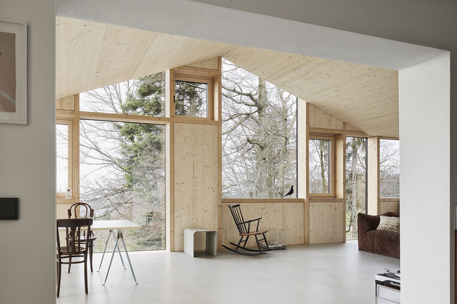
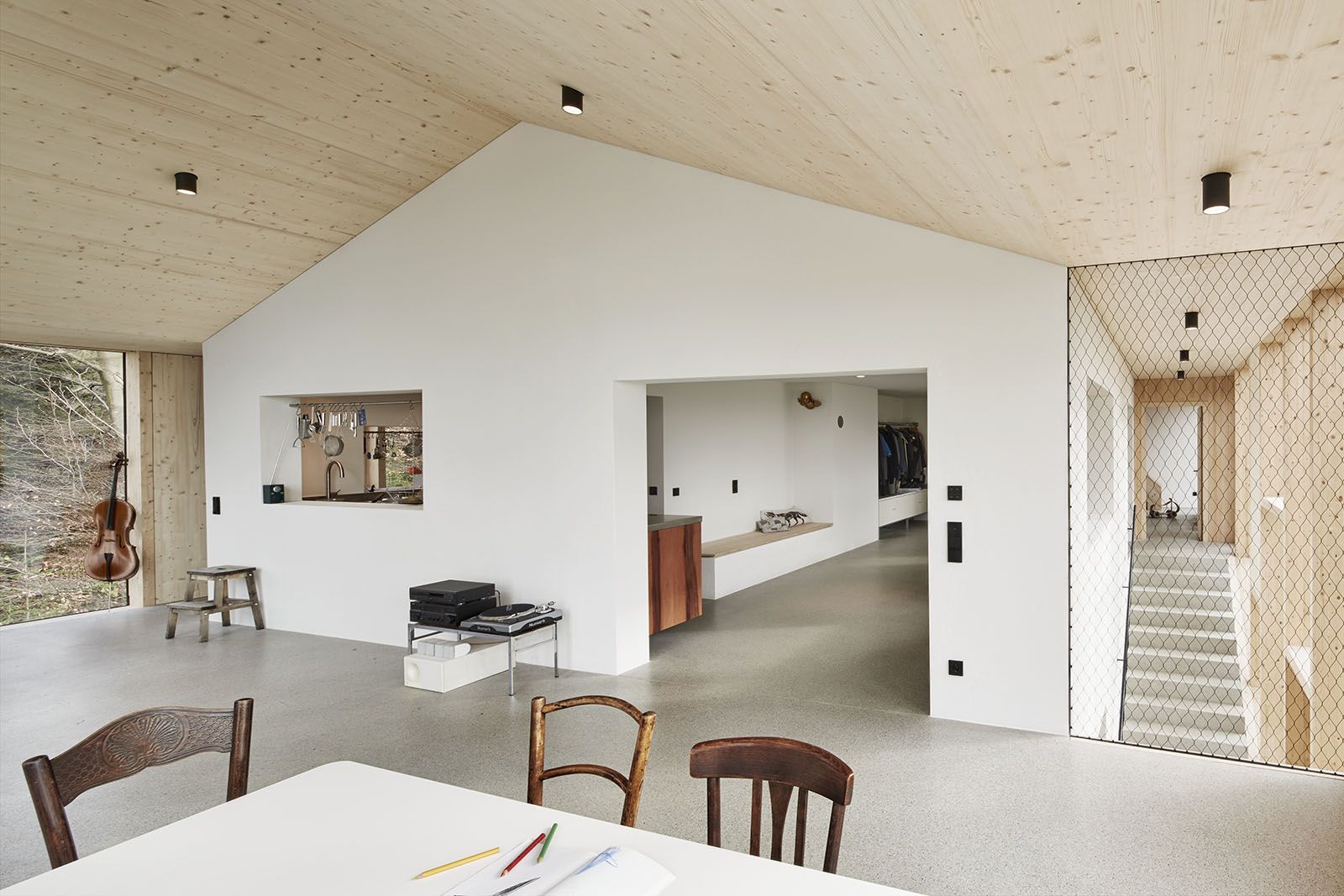
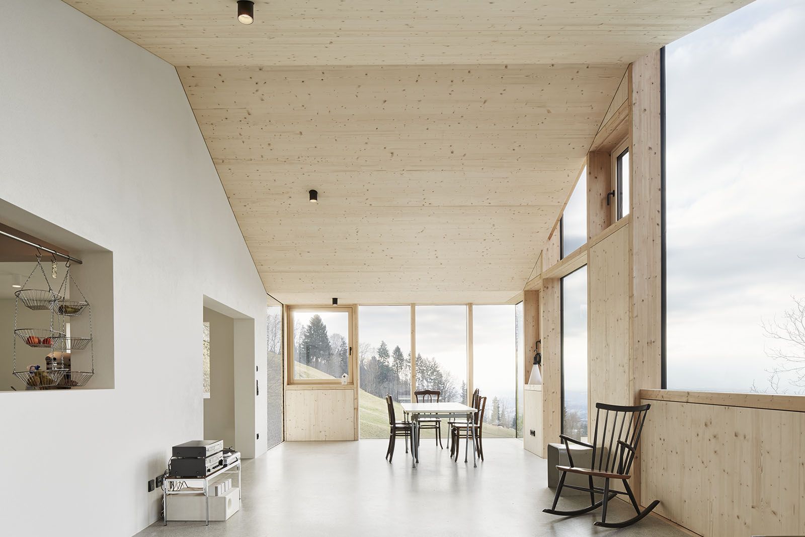
I have to show you a the living room in this home too. Minimal, concrete, wood, lots of windows and light.. LOVE! I’m not sure how many men like to do this, but a lot of women like to re-arrange their rooms. Here that would be easy to do, especially with this kind of furniture. It’s not too bulky and heavy, so it’s easy to change the layout of the room.
This home looks like a new build, but the house is actually from the 1960s. It was renovated by architect Jochen Specht. I think it’s really special and love the modern feel throughout and of course all the windows.
All images by Adolf Bereuter.
Love this!
I think it’s cute. x