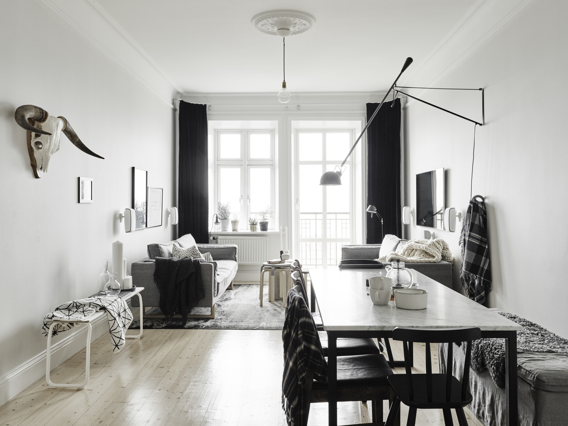
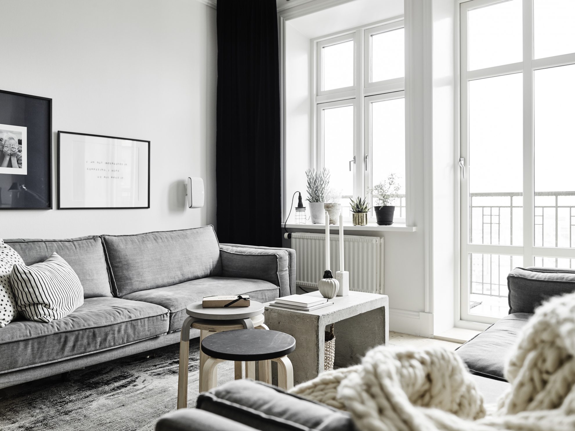
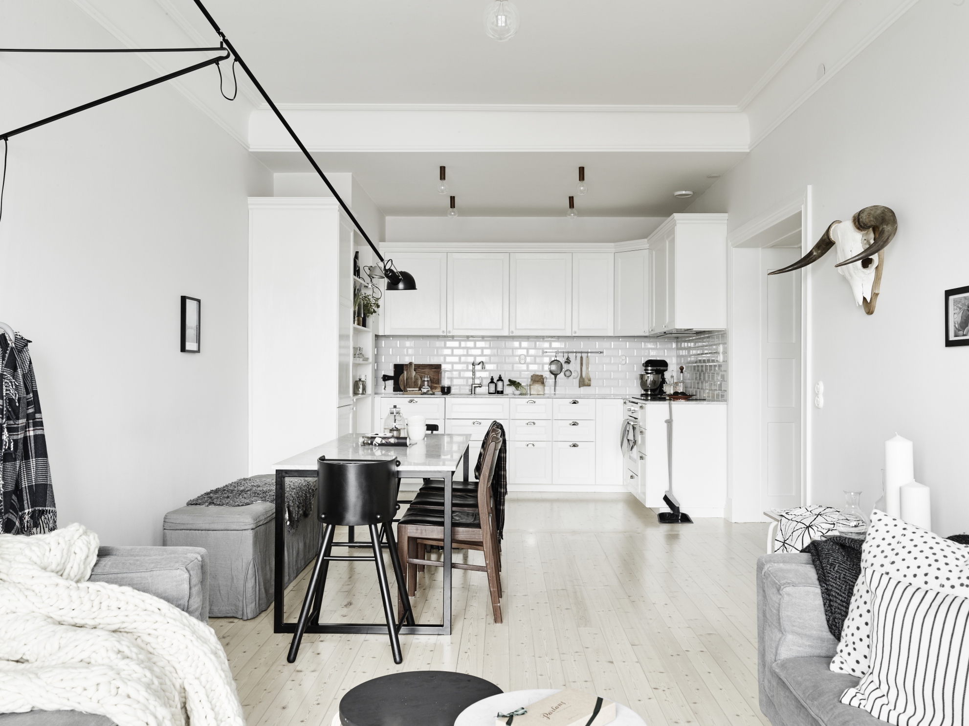
I think this is such a great solution for a modern open plan living. They even have a TV in this apartment. Most of the time they’re hidden in interior photos.
The layout of this long room is totally the way I would have done it. I like the invisible divide of the living and dining space. The dining table is in a perfect position as it’s not taking up too much of the room. There’s plenty of space to move around.
all photos by Stadshem
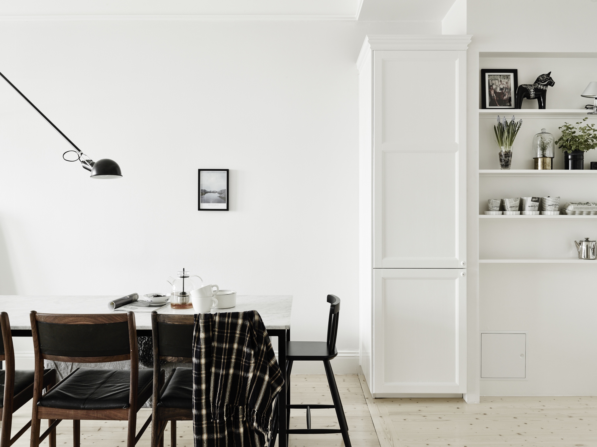
It’s all very neutral, but I think it looks great. It would be easy to inject a bit of colour here if you wanted to. I think the most recent favourite amongst bloggers would be to paint a wall blue. For Blue Trends check out my Pinterest board here.
Happy Friday!! x
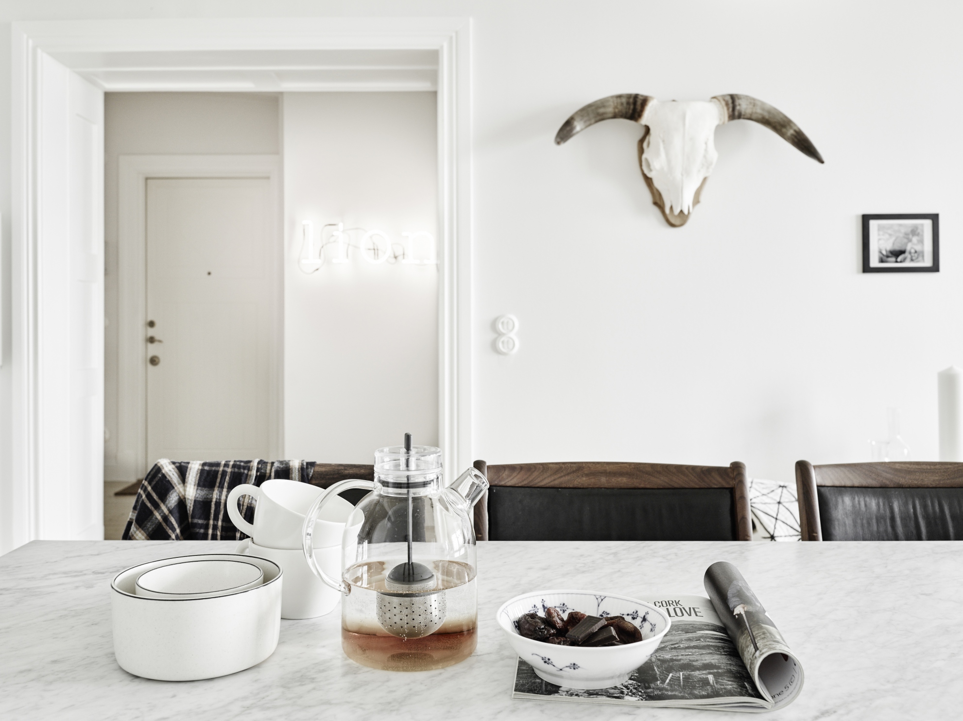
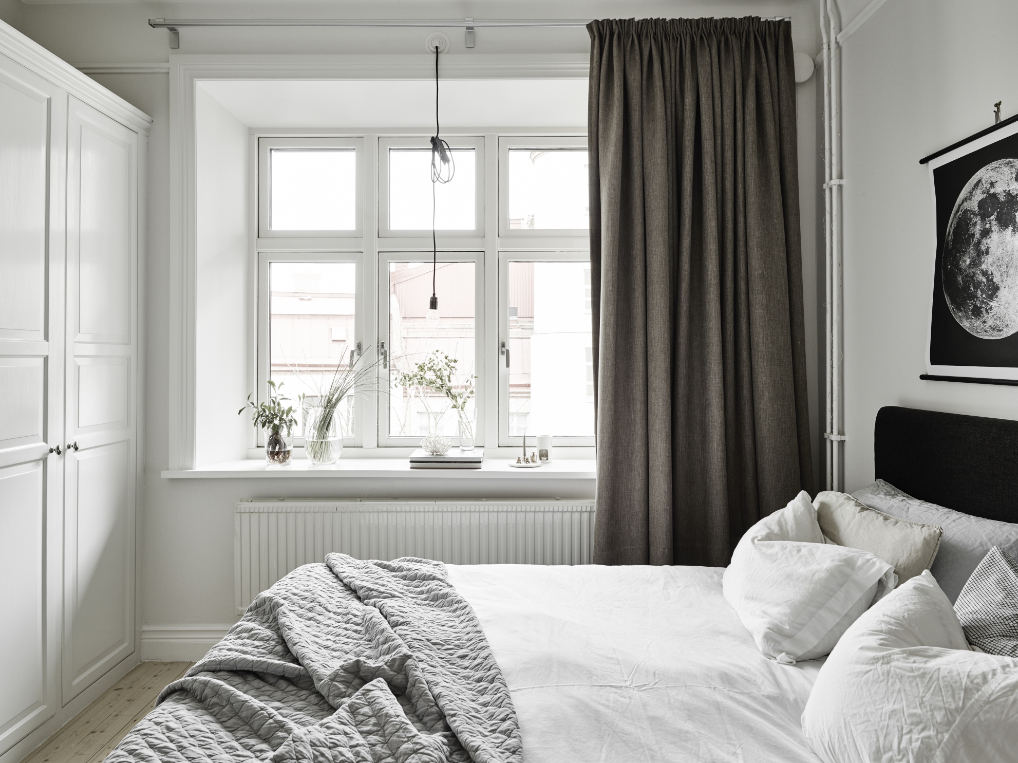
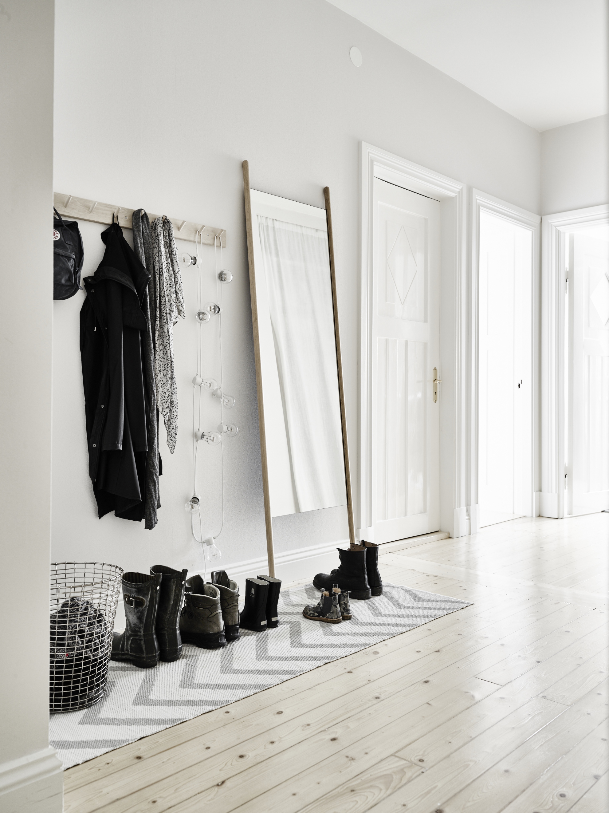
nice to see small space styling and decor, many modern apartments have this kind of lay out, and I think people make the mistake of buying furniture that is way to big for the space, and it ends up feeling cramped, always best to pair back if possible.
Very true! It’s nice to have a bit of openness if possible.