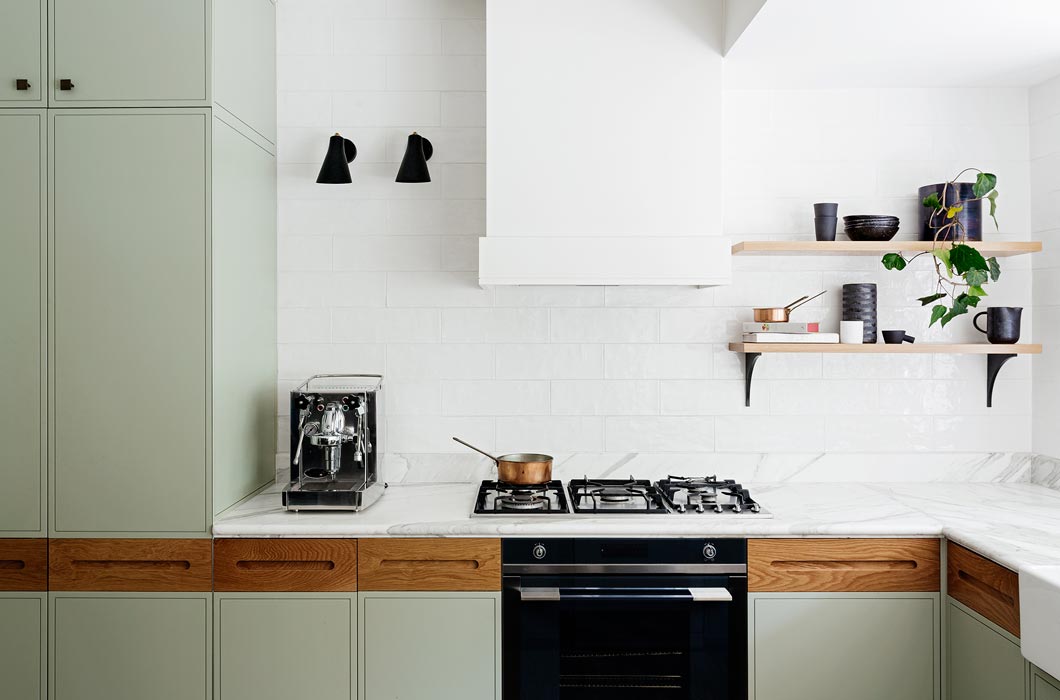
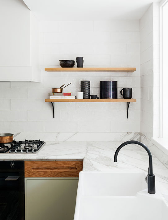
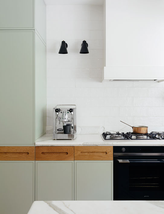
I came across this two toned kitchen yesterday and thought it was nice for a start, but also quite different. I really like how the wood and the sage kitchen units softens the space. It looks like a really inviting kitchen. The marble worktop and the copper pots are also favourites.
Ceramics are so trendy just now. I keep looking for the odd piece when I go to charity shops or flea markets, but still haven’t found much. France was good for ceramics.. I know I would have found loads of nice things by now if I still lived there, but I’ll keep looking here.
How good do these black pieces look on the open shelves?! I’ve started a ceramics board over on Pinterest if you want to discover some great artists.
photos by Felix Forest design by Arent & Pyke

Such a nice kitchen!
Spite of the white surplus it does not look cool, but very inviting.
Greetings, Leah.
I totally agree with you, Leah. thanks!