I’ve mentioned before that the kitchen was my least favourite room in our new home, well.. it’s now my favourite! It’s got gorgeous natural light, feels welcoming and the Lundhs natural stone worktops actually sparkle! I feel like our kitchen renovations have been a big success and the transformation is huge!
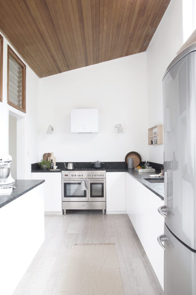
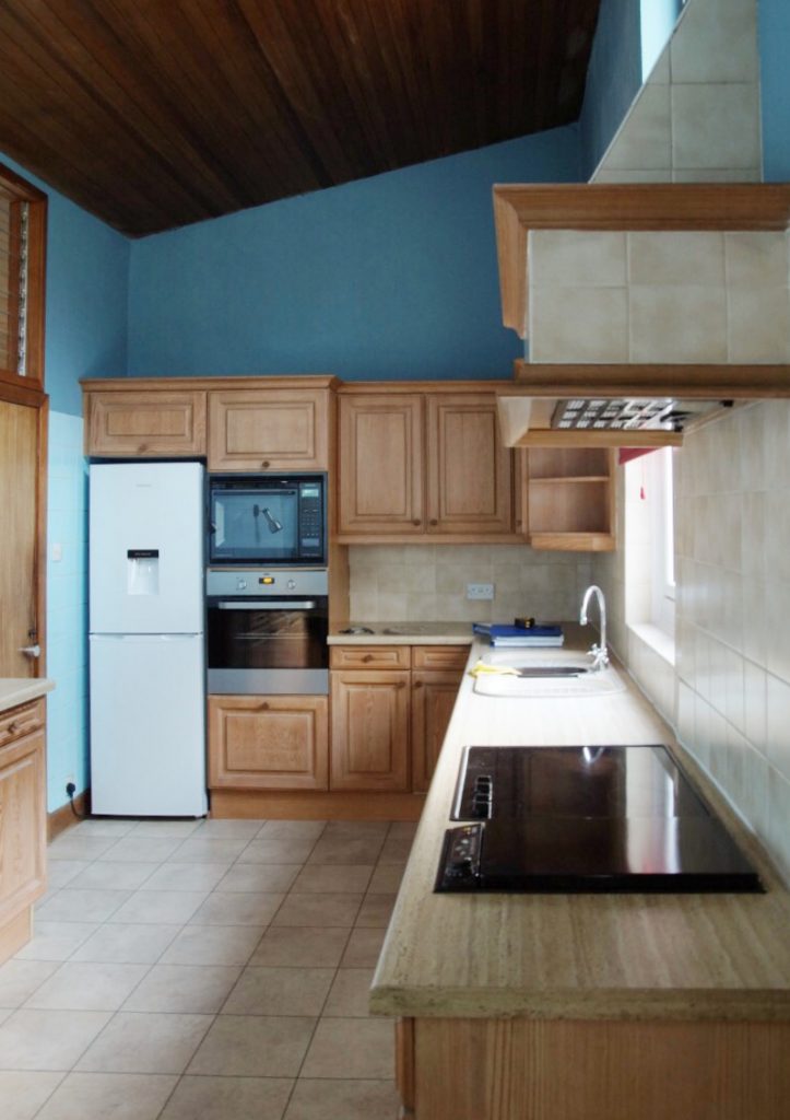
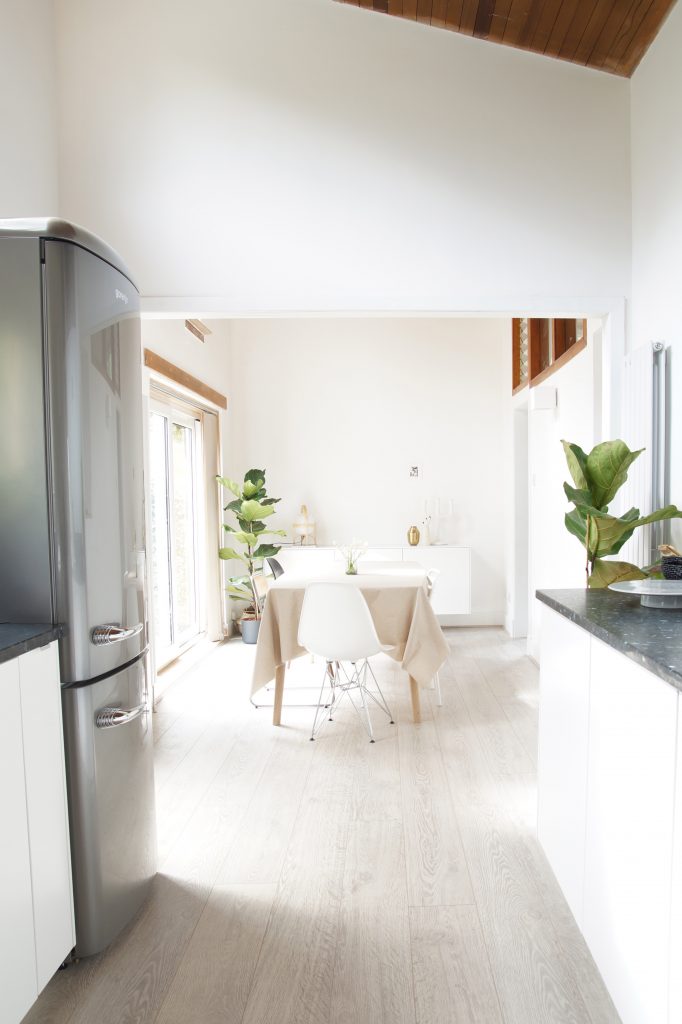
I want to show you a before and after of our kitchen renovations, so you get the full picture. It really was very dark and unwelcoming. It took me ages to figure out the space and I mean ages! It was the most difficult room to design. The room is narrow and has extremely high ceilings. We knocked through to what used to be the family room and now have a kitchen / dining room with lots of natural light. We’ve replaced a couple of windows and changed to door to the conservatory to a modern glass door. It’s made such a big difference. We’ve also removed the door to the kitchen and the living room. It feels more like open plan living and it’s much better than having small rooms. All of the walls in our new home were textured, so they’ve all been plastered and painted. Again, this made a huge difference too.
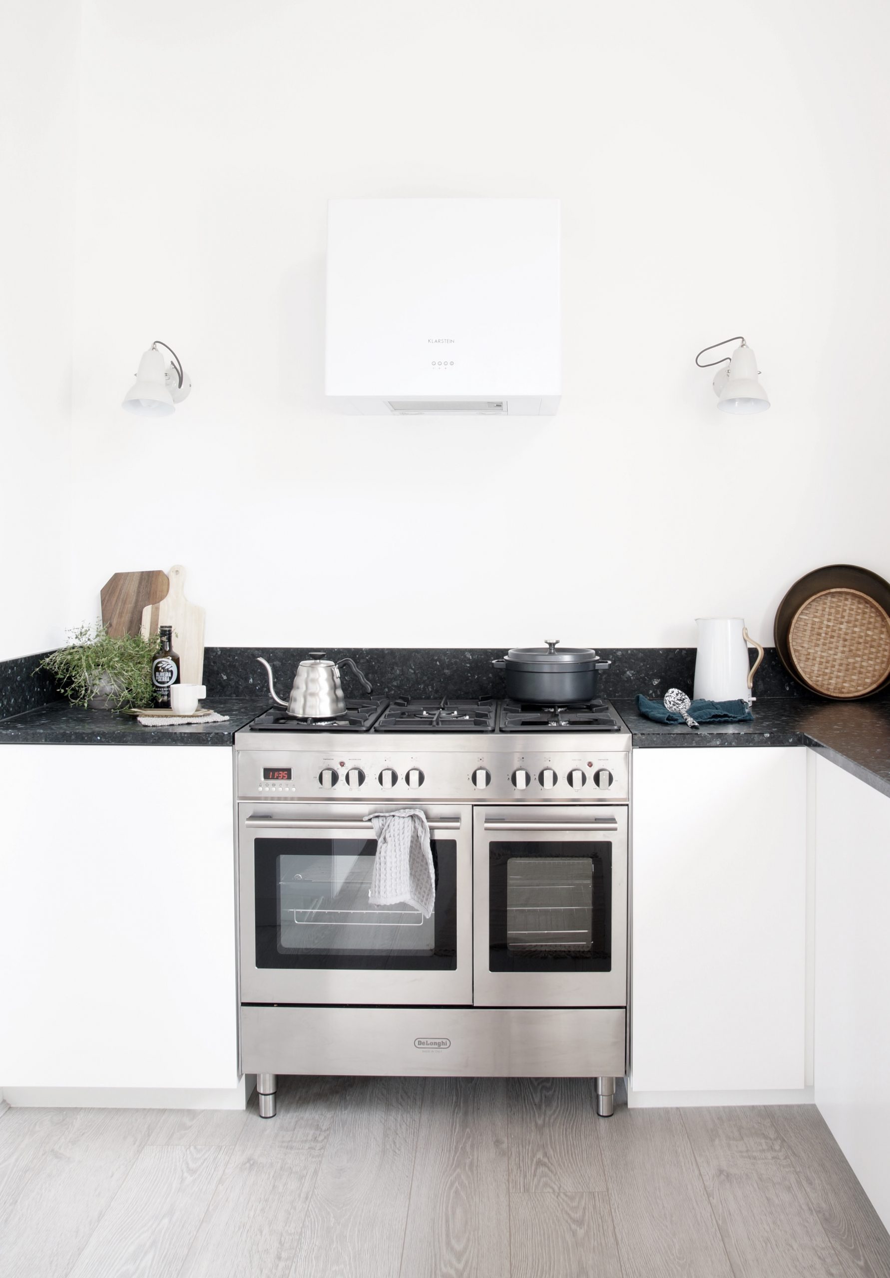
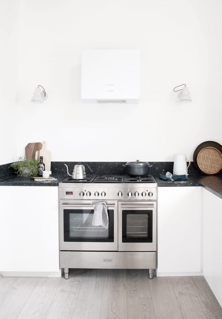
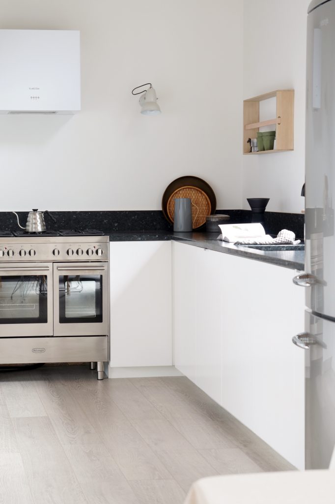
I wanted the cooker to be in focus, or rather cooking. When we lived in France I loved to cook, but somehow I got out of the habit of cooking everything from scratch since moving back to Scotland. It something I really want to change. I wasn’t sure if it was possible to fit in a range cooker, but it was high up on my wishlist and with a bit of re organising we managed to fit one in. I’m so happy with our DeLonghi cooker. It’s got two electric ovens and 5 gas rings. Here’s the model we chose – DTR 906-DF, you can see more details here. I’ll show you more about the oven soon and maybe even a recipe. I have some really nice ones from France.
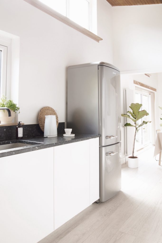
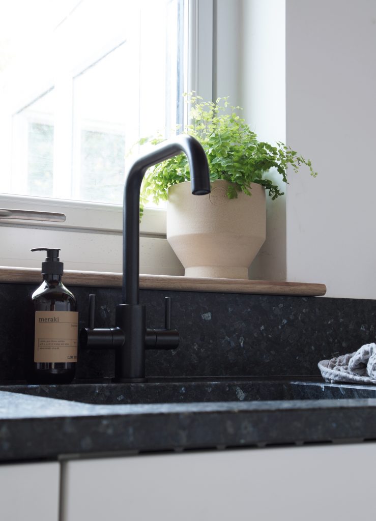
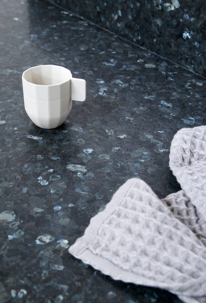
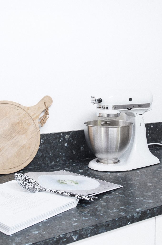
Another priority was preparation space and good worktops. We’ve chosen Lundhs natural stone worktops and they are just amazing. They not only looks stunning, but they’re also very durable. I’m going to write a blog post about the installation of them and some more close up details as they’re so special. Not one is the same as it’s a natural product. It’s 100% natural and 3 million years old. You can read more about them here. The stone is actually from where I grew up in Norway, so it’s extra special to me. There were 4 tones to choose from and we chose Emerald Silk. Lundh’s Emerald is the darkest tone in the Lundhs Real Stone collection. I think these worktops would work just as well in a traditional kitchen, as in a modern one. They are truly beautiful and I couldn’t be more pleased with them.
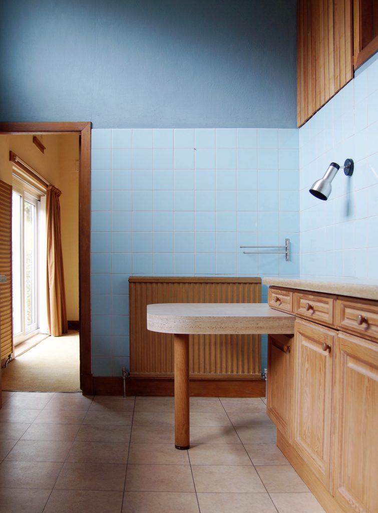
It’s changed a bit hasn’t it?! We’ve still got a few things to do, but it’s getting there. The strange vent windows will be changed to normal glass very soon and I’ll show you more of the new glass door when I get a new floor for the conservatory.
I’ll tell you a bit more about the details in our kitchen.
For the units, I wanted something very minimal, so I went with IKEA Veddinge as the doors were matte. You’ve probably noticed the lack of wall units. We have plenty of space as it is and I’ve even got an empty cupboard. If we want to add them in the future, it’s easily done.
All the lighting in our entire home is from David Village Lighting. They have such a great selection and stock most big designer brands. We’ve got Anglepoise Original 1227 wall lamps in linen white on each side of our cooker hood. They give plenty of light and I think they look lovely. It was nice to break up all the white a bit. In the dining room we’ve got the stunning Santa & Cole Cestita, but I’ve also got another couple of table lamps, so I’ll be changing things around. You can find the lamps here and here. I’ve also got a very nice Flos light to go up over the dining table.
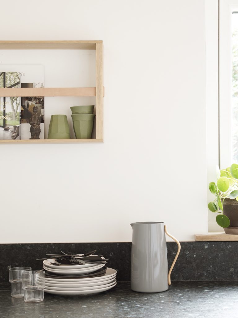
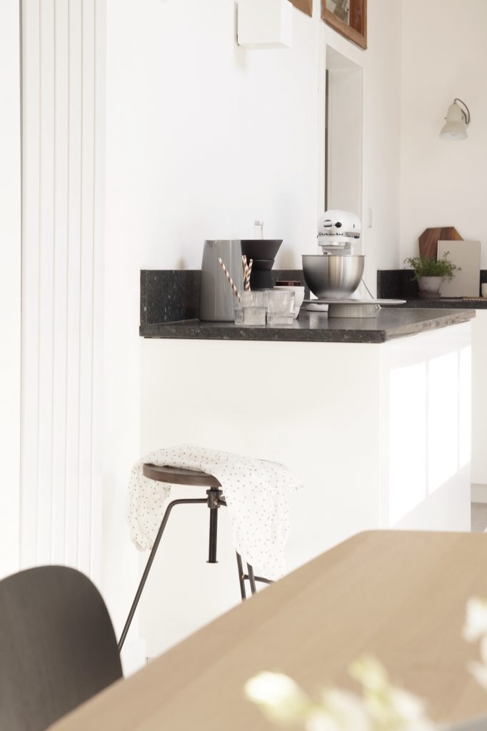
The Oak shelf by Skagerak is maybe a little unusual in the kitchen, but it fits in really well and I’m sure I’ll have fun changing it from week to week. I got it from Amara. I also got the olive coffee cups, plant pot and the KitchenAid from there. I’ve been wanting one for years, so I can’t wait to start using it!
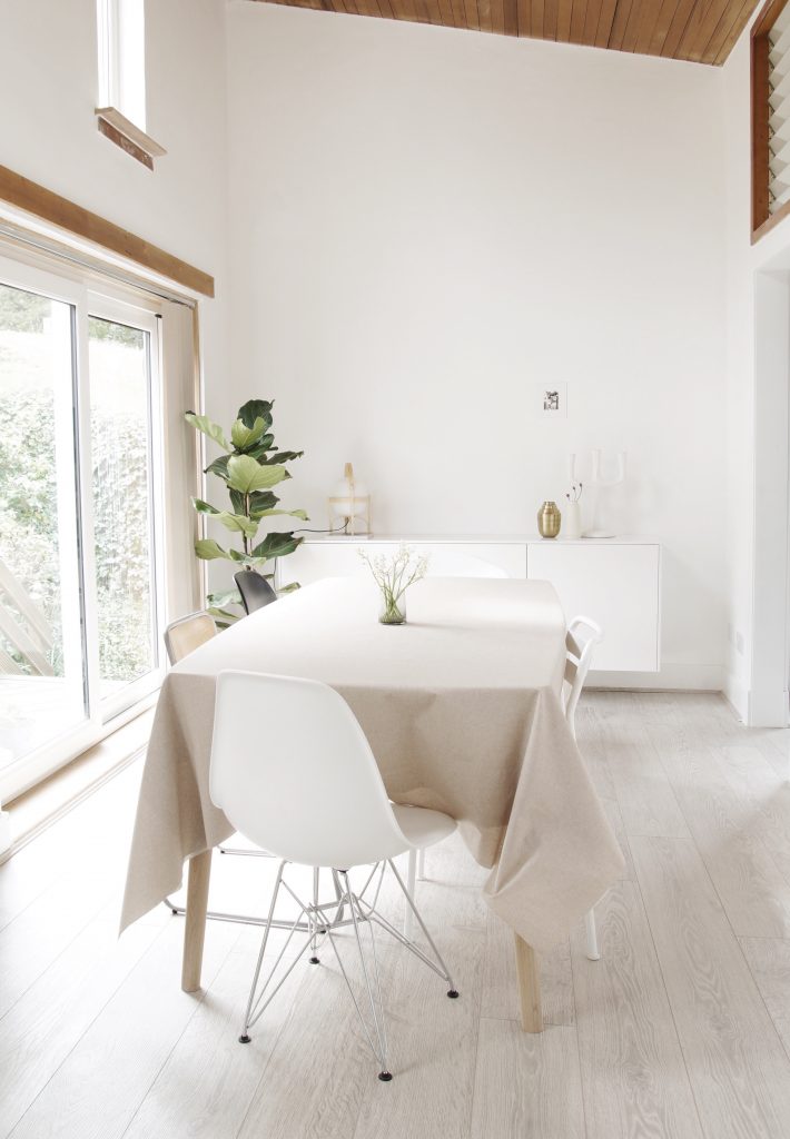
Our dining table is from Out & Out Interiors. The table is called Caso and can be extended to 270cm. I’m looking forward to some big gatherings around this table. I sourced the oil cloth from Stoff & Stil and think it’s great they have a linen look. I don’t have it on all the time, but when we’ve got kids round it’s very handy.
One of the first things we did was to change the radiators. Instead of gold radiators, we now have tall white radiators from Best Heating. I’ll show you more soon as I’ve chosen quite a few different designer radiators. I tried to make them match what was going in each room.
The tall retro fridge/freezer is from Gorenje. We chose the Silver ORK193X, you can find out more about it here. I did quite a lot of research before buying a new fridge/freezer and this one had a lot of features I liked. I’ll show you more details soon.
Our new kettle, Emma, from Stelton is brilliant. It’s not noisy like our old one and it looks great. The matching pitcher is lovely too. We’ve already used it a lot outside, as we’ve had gorgeous weather. I love the beechwood handles! Danish design at it’s best! Designed by duo HolmbäckNordentoft and inspired by 50 and 60s design.
The floor is the same as in our living room (Quick Step – Largo) and I’m so glad we did that. It makes it look more like a big space instead of separate rooms. You can see more about the floor here.
Please do ask if you have any questions! It’s been a long process, but we’re really pleased with our kitchen renovations and now spend a lot of time in our kitchen / dining room.
Some of the items in this post was sponsored, all views are my own.
Hege, your kitchen is stunning! Can I ask you where you got your range hood from?
Thank you so much, Gail. The cooker hood is from Klarstein.