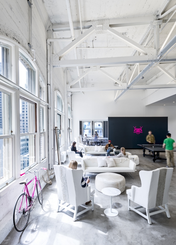
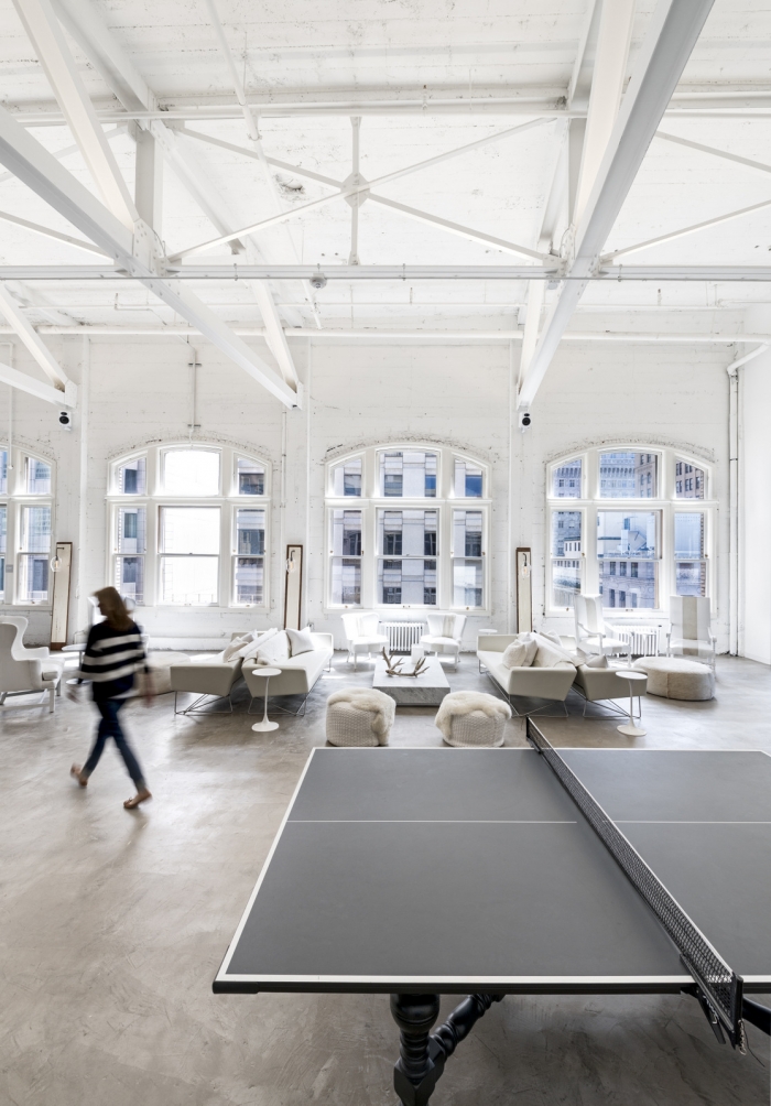
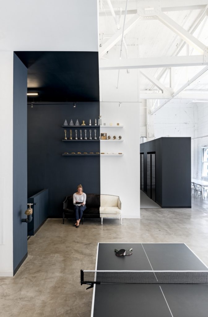
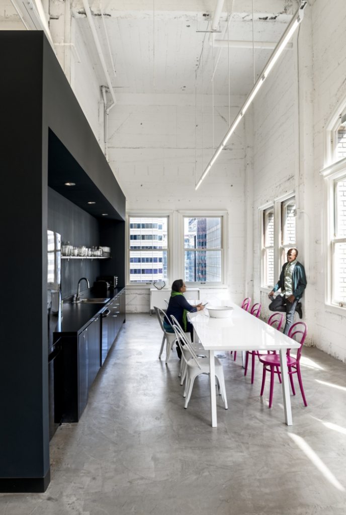
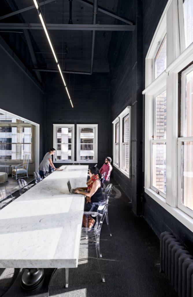
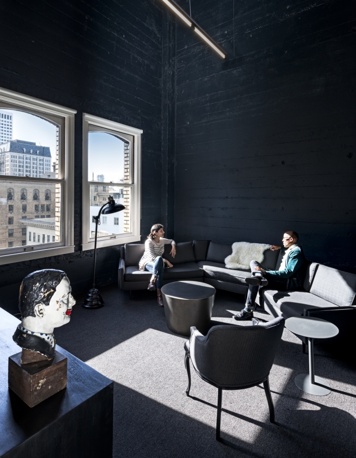
I would love to work here or live here for that matter. This is the office space for ad agency Muh-Tay-Zik / Hof-Fer located in San Francisco. It was designed by Gensler. It looks like a nice place to work. It’s bright, there are lots of nice spaces to meet, the rooms are quite different. I like the fact that there are all white rooms, all black rooms and black/white rooms. It makes the space look interesting and creative. As the company is an ad agency I’m sure the focus was on creating a creative office space.
The polished concrete floor is still a favourite. I keep talking about large windows and high ceilings and I guess these would do. Wonder what the ceiling height is here? It’s great to see an old industrial building being brought back to life. There are too many of them sat empty.
all photos by Gensler
Happy New week!
By the time this is published we’ll be in Portugal.. ! x
