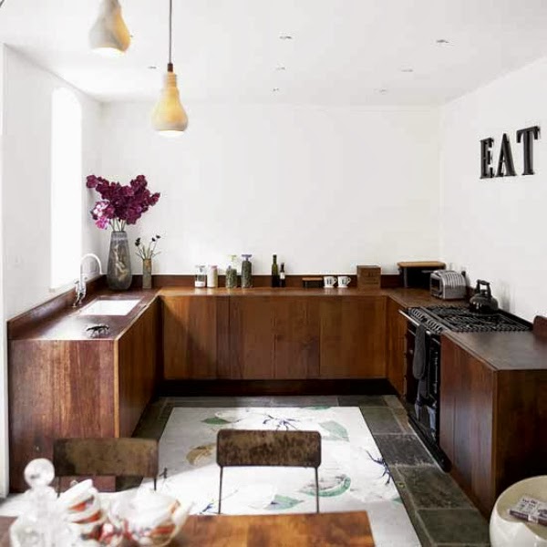
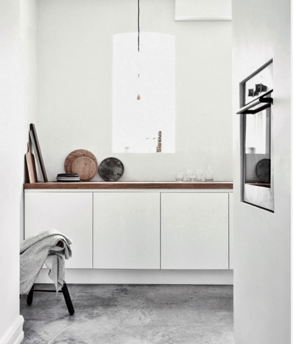
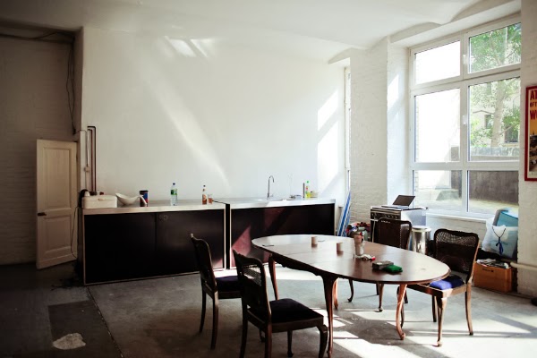
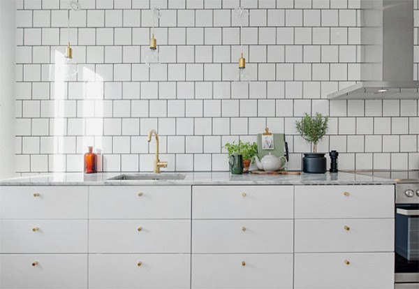
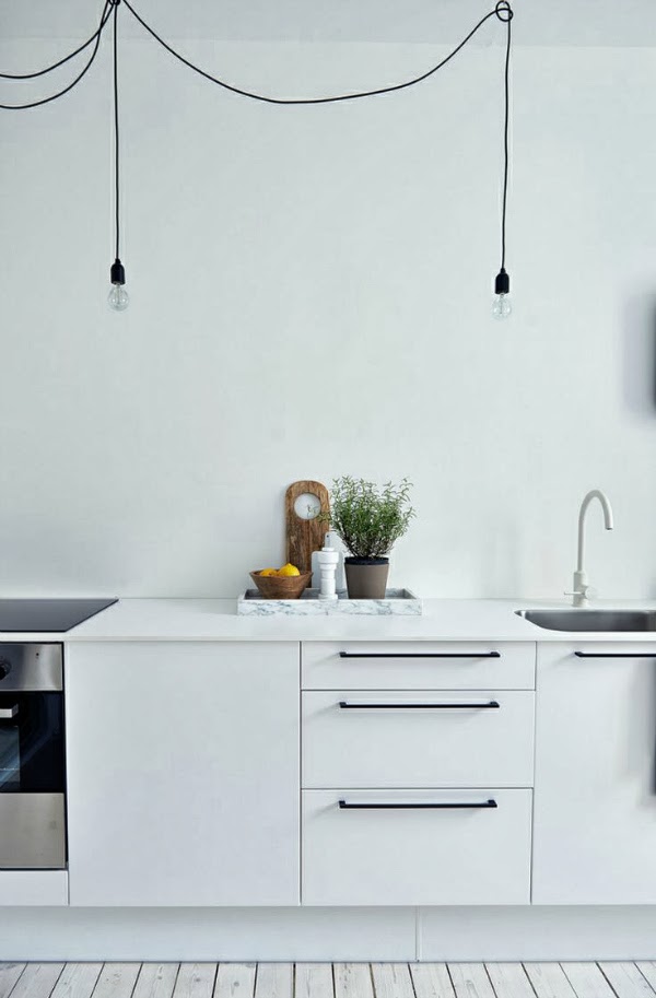
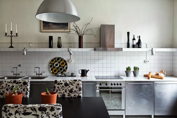
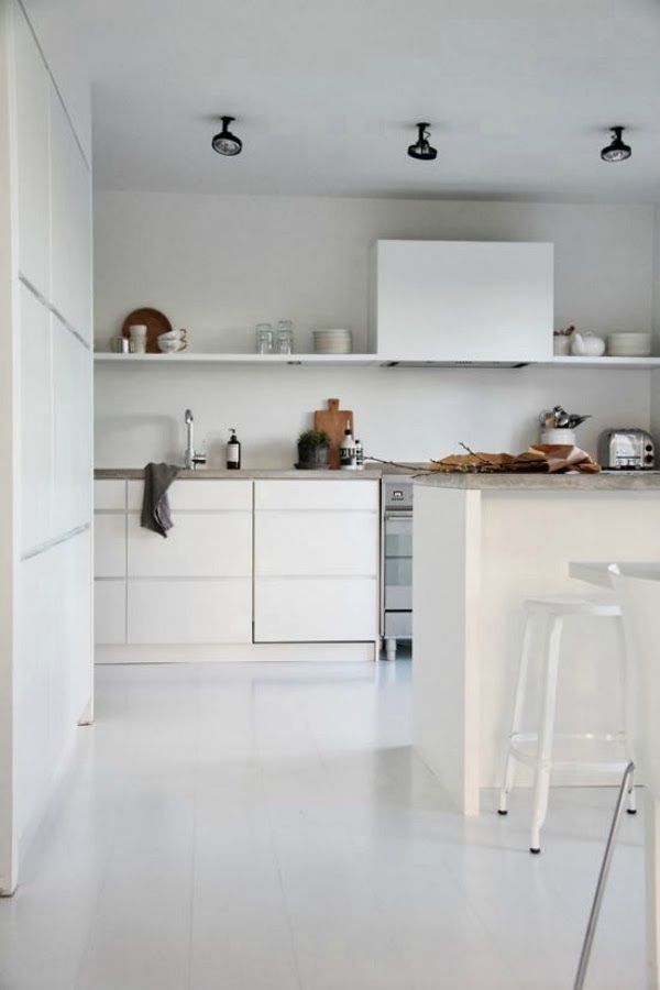
I’ve noticed a change in kitchens lately and I have to say I like it. The lack of wall units make kitchens appear larger and more open.
I’m not that tall, so for me wall units can be pretty awkward and things difficult to reach. These kitchens would suit me better.
photo House to Home
photo Norm Architecture
photo Alvhem Mäkleri
Without the wall units it’s easier to add cool lighting
photo Alvhem Mäkleri
and display art and decorations.
photo Fantastic Frank
photo Elisabeth Heier
Are you ready to take down your wall units yet? Would the lack of wall units make things better in the kitchen or wouldn’t you have the space needed?
See you back next Tuesday for more tips!
hx
This is interesting! I haven't noticed this trend here in New York yet, I wonder how it will be received. Although it's a cleaner, sleeker look I think Americans will be upset by having less storage.
I agree totally! Never had wall units, always thought they were ugly, making kitchens look like monsters. I prefer a long open shelf instead. And concerning the space – well, do people really need all that stuff in there? I'm not sure. Sometimes less is more (and maybe the reason why that trend hasn't reached the States yet…)
I'm ready to take the wall units down in the kitchen. It looks so much more spacious and fresh without them. We are just so used to these wall cabinets.
I love kitchens without wall units but I do wonder the storage… We struggle as it is with wall units (but our kitchen is tiny).
Totally agree, makes it look so much more inviting. Solution for more storage could be one wall with full height cupboards and then the rest without. And in addition to no upper storage the worktop height should not be too high. Makes it really difficult for smaller people to work. Have a good day.