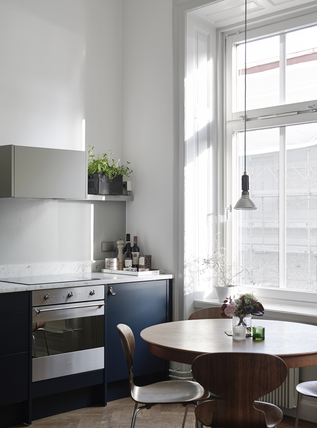
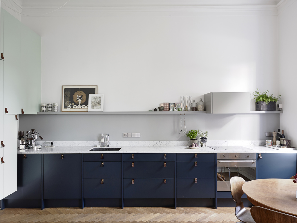
I really like two toned kitchens, so when I saw this apartment on Entrance I had to share it. I’m not a great fan of wall units, so I like this shelf over the base units. It’s a nice space where you can display pretty things and why not art too?
I’m also loving the pop of green here. Nice plants! It makes the kitchen look nice and healthy.
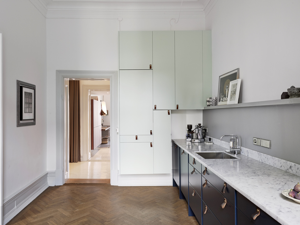
With the addition of all the light blue wall units it makes up for all the space not used on the main wall of the kitchen. It also blends in really well with the wall and let’s the darker blue units take centre stage. It wouldn’t quite look the same if all the units were dark blue.
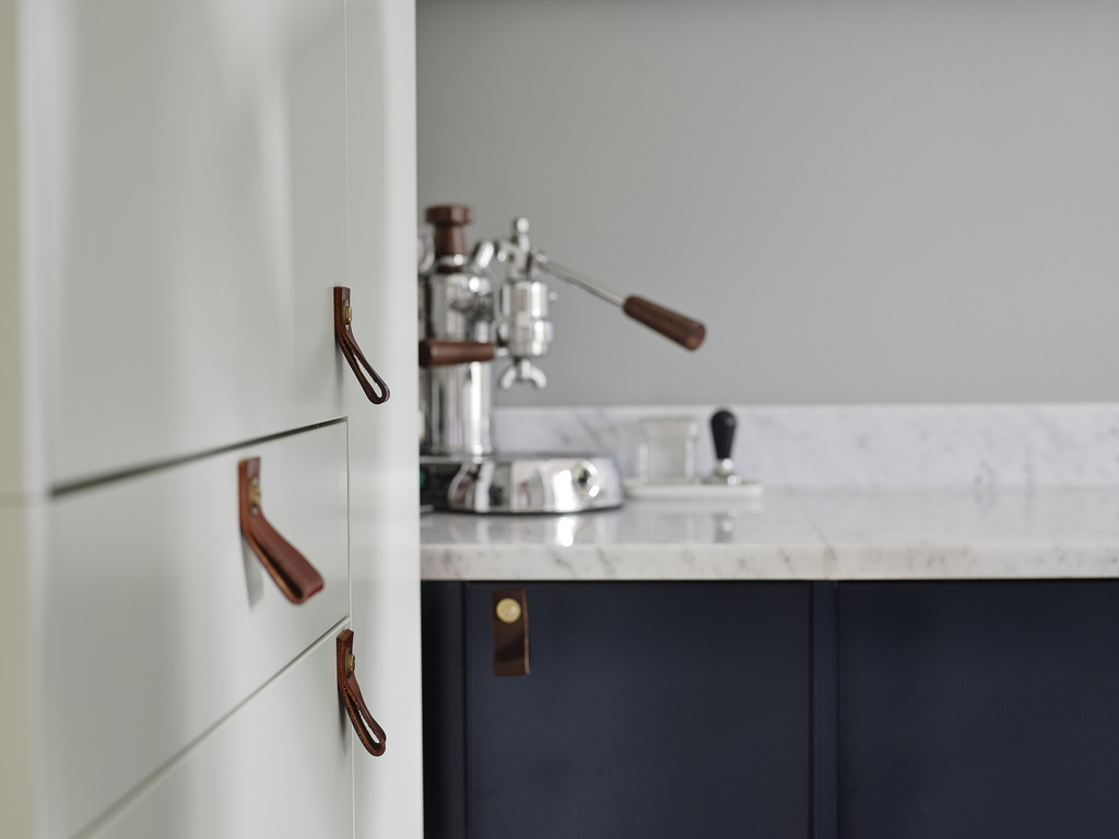
Marble worktops, leather door handles and herringbone wood floor. Yes please! The leather door handles can be DIYed (tutorial here) or bought.
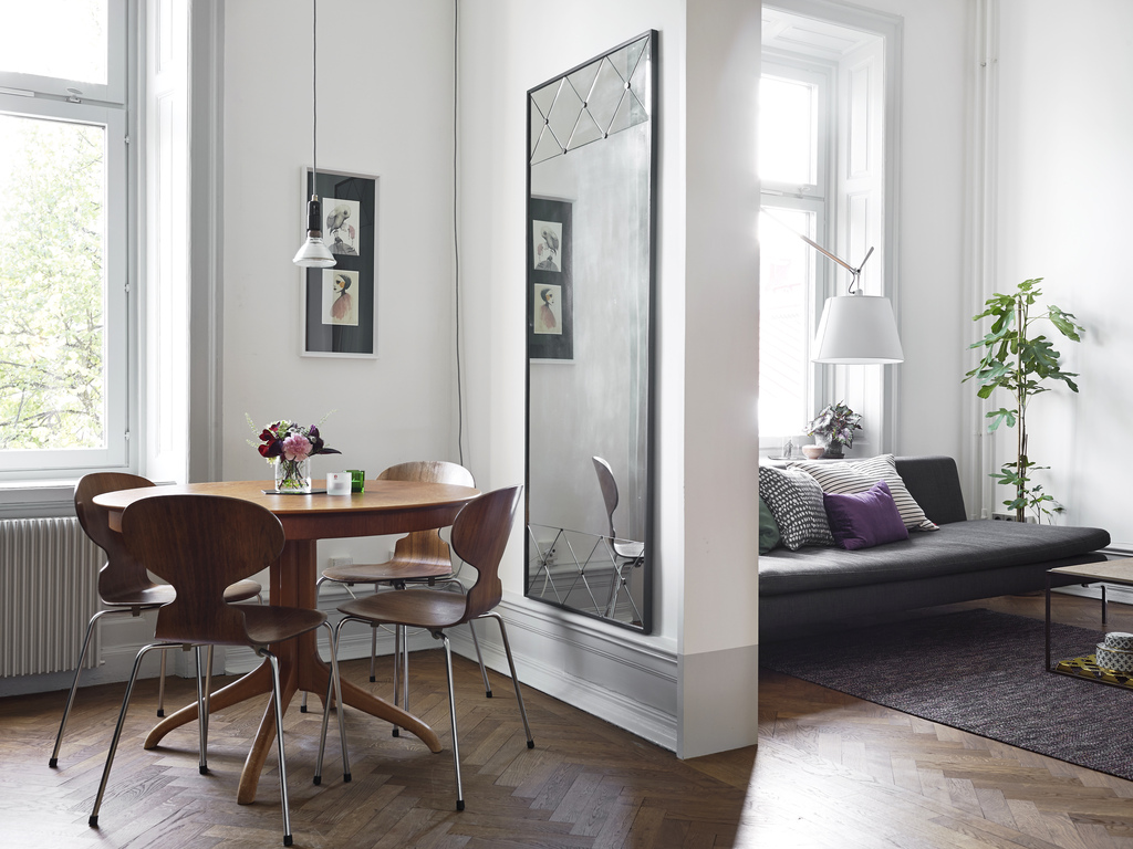
The idea of a large mirror in the kitchen is a really smart one. It makes the room feel larger and it reflects all that lovely light from the big windows. Other mirror posts here and here.
all photos by Entrance
I’ve also gathered a lot of two toned kitchens on Pinterest you can see them here.
