Like I mentionned in the before post it was time to move away from baby blue and yellow and make this into a boys room suited for a big boy. We decided on black and white theme after a few nights of late discussions. Probably more for him to stay awake longer, rather than anything else, but we had fun.
My focus here was on three things, paint, storage and a big space to play.
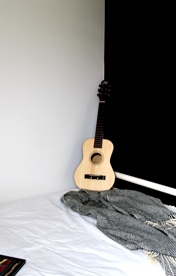
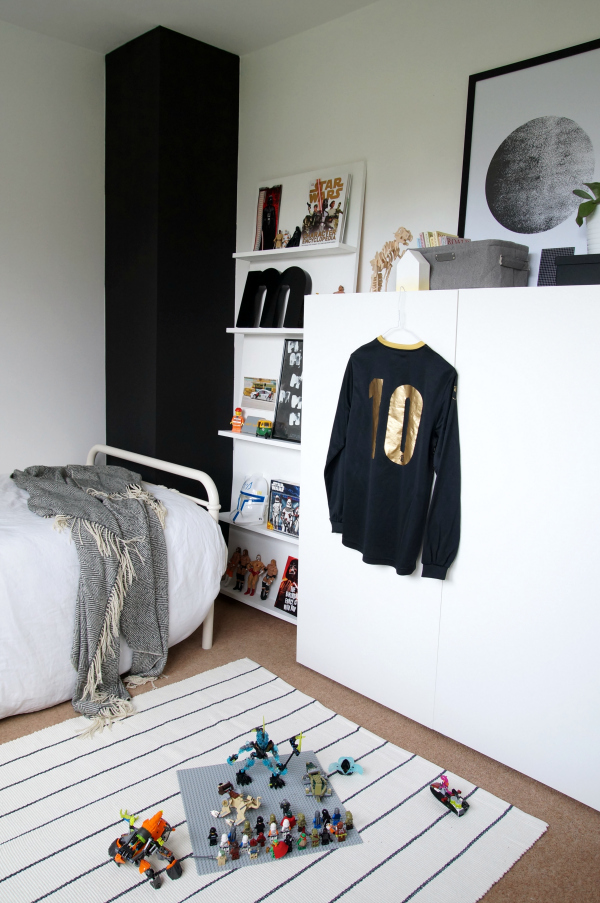
“Modern” homes don’t have many features, so where possibly can, I like to add one. I chose to make a feature of the part of the wall sticking out. Instead of making it blend in, I painted it black. I was kind of wondering why it was there in the first place and figured out that it was just to make our built in cupboard in the hall larger. Fair enough, we need it!
The white paint I chose was actually fantastic and it’s perfect for children’s rooms. It’s scrubbable, stain resistant and doesn’t smell. Amazing!
 What was really exciting was that I was able to put the bed up against the wall. I thought it was too long, but I tried it and it worked! I think with about 2 cm to spare. This has of course opened up the room a lot and freed up a lot of space. I’m not a carpet person, but when you’re renting you don’t really have a lot of choice and have to go with what’s there. I don’t mind the carpet as much now with the light black and white rug on it. It also makes the room feel lighter, as do the white paint of course.
The plywood shelf I made a while back has been moved into Magnus’s room and painted white. If you would like to make one you’ll find the DIY here. It’s surprisingly easy.
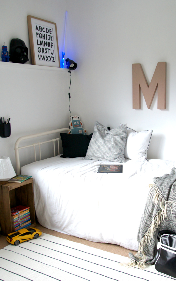 The room now has proper storage space for all toys and books. It’s so nice to see the amount of space it has freed up.
Only think I’ve got left to do is paint the blue toy box – white.
I can’t wait to see him use his room more. He loves it! x
PS! LAST CHANCE to enter the MATEA giveaway. For details click here. I’ll announce the winner tomorrow!!
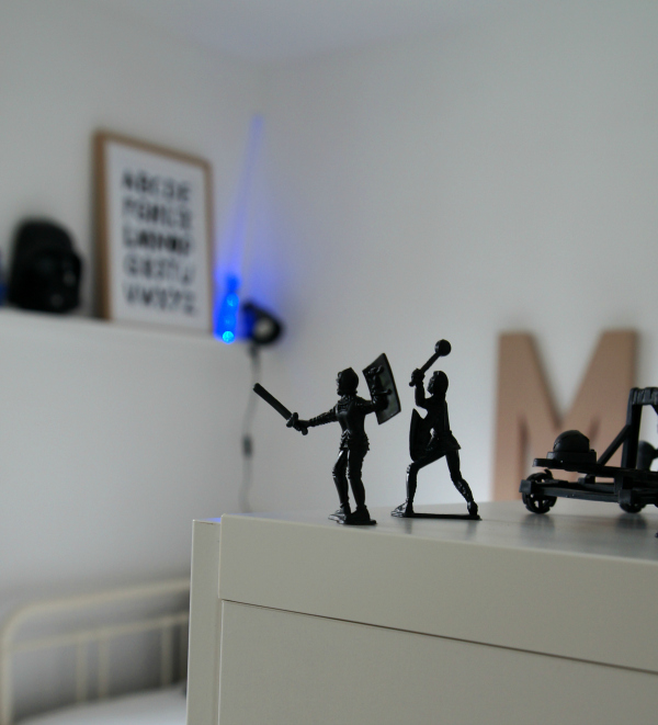
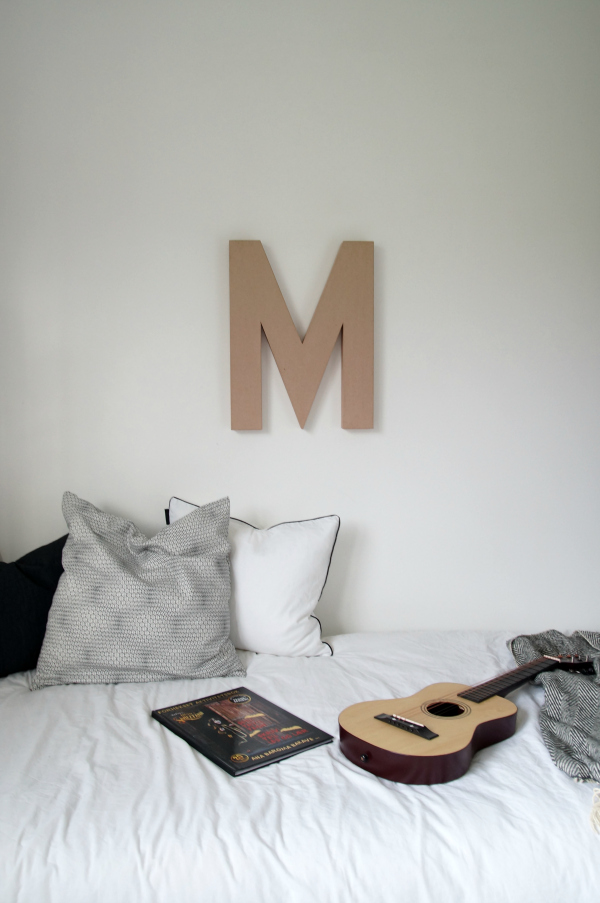
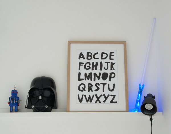
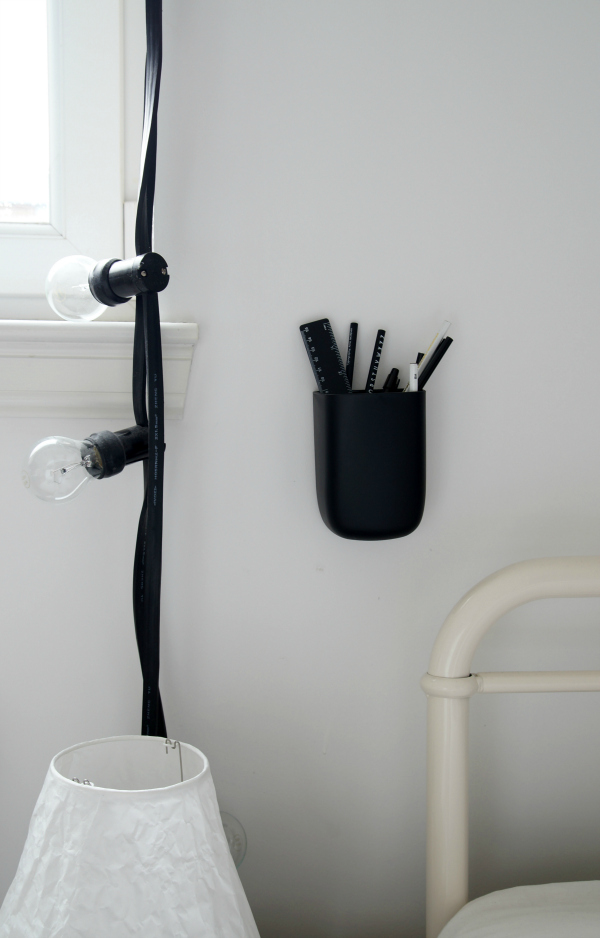
The room looks lovely and not overly “childish”. I think it’s very calm and not overly stimulating, as many kids’ rooms tend to be.
J’adore Hege. Charmant, minimaliste et elegant. On voit que l’enfant à grandi ! Un petit jeune homme habite cette chambre ! 🙂
bises
[…] few days ago I showed you the Before and After of Magnus’s monochrome boys room. It feels lighter and brighter. I’m so glad I painted […]