I’ve got major floor envy. What am I talking about.. I mean apartment envy!
Katty Schiebeck has been really nice to us and let us know some details of this project.
This is not just an apartment, but an apartment in the luxury tourist area Passeig de Gràcia, Barcelona that you can by the way rent for holidays.
“We focused on furniture design and artistic works for a sophisticated place with personality. We wanted to create a singular and different space that differs from the common holiday rental properties.”
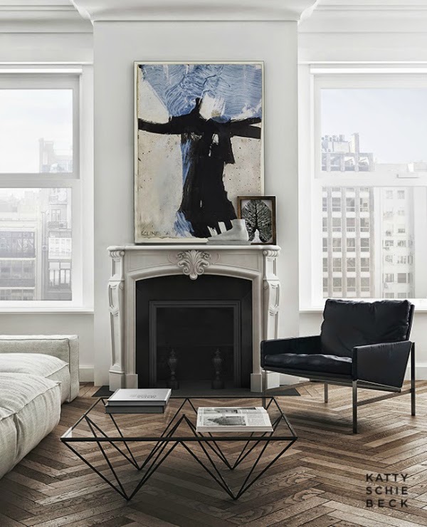
In the living room an image from Klein was chosen as the central axis, the couch is from
Piero Lissoni and the lamp
Jean Prouvé.
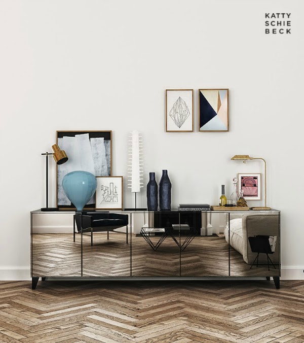
Above the mirror dresser we can find works of Blanca don, and Ken White, a lamp Fog & Morup Jo Hammerborg Slow.
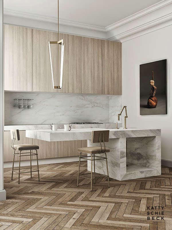
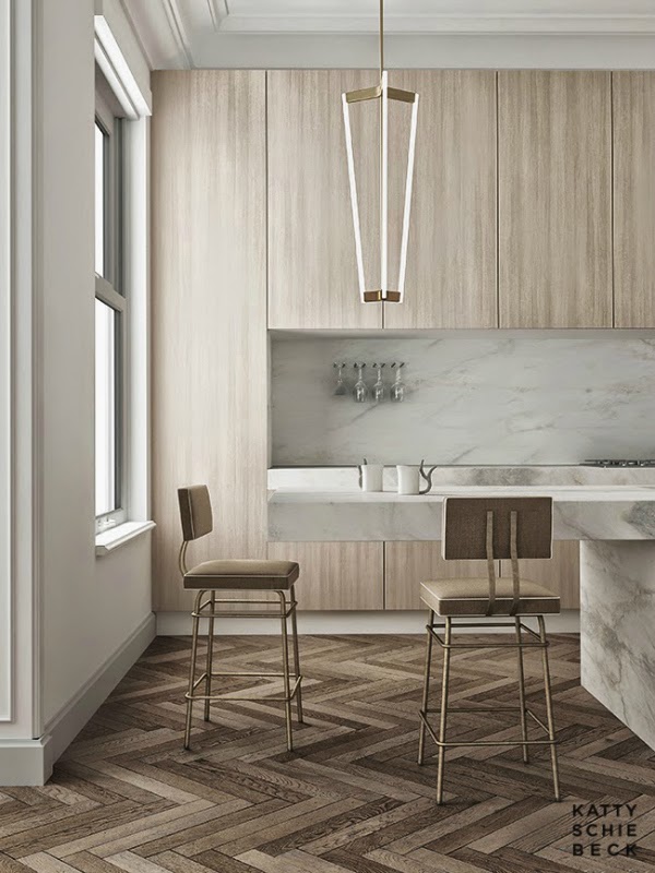
Wood and marble was used in the kitchen to get both a sophisticated and warm cuisine, the lamp is from
Michael Anastassiades and the photograph is from
Nacho Alegre.
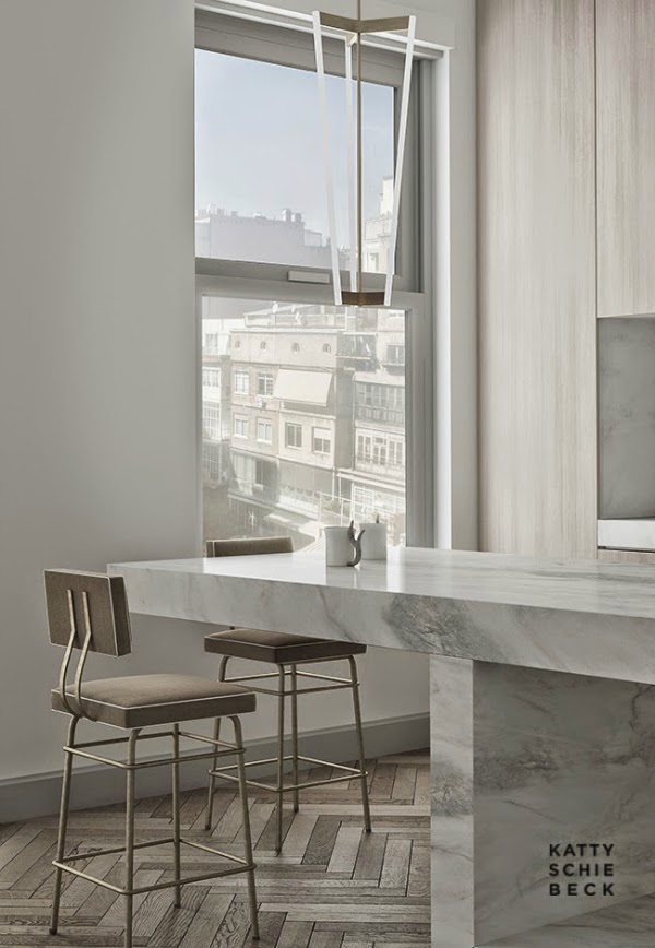
“The kitchen is an extension of the dining room so we worked with a marble structure. What we needed was to get the interiors were impressive as the purpose of the reform was to capture the widest possible audience. Customers would choose these apartments for rent through images and hence the importance of getting the project stand out visually. We chose to use concrete slabs on the walls and floor, this was a gamble since it is a cold and unwelcoming finish for housing, but very sophisticated to enjoy a few days in the city. The amount of light we had with that large windows allowed us to use this resource.”
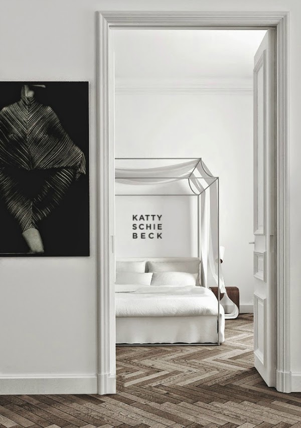
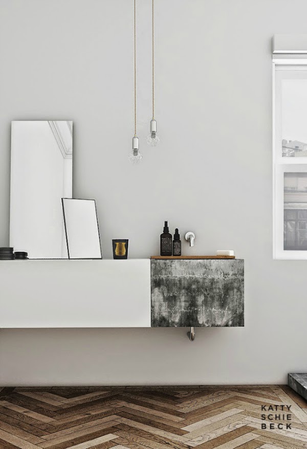
“This defined the rest of the project, we continue with dark colours to get a sophisticated atmosphere. On the other hand we used elements in wood and carpets to counter and bring warmth to the whole picture. It was easy to work on a such strength material because the furniture was so visible that’s why we opted for pieces with character, like the mirror and the screen in the bathroom or wood bedside table in the bedroom. The photographic portraits convey closeness and warmth to spaces.”
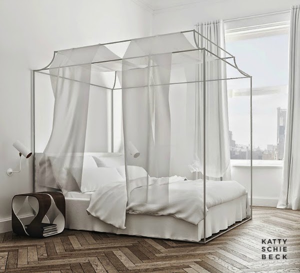
“About the bed we worked out here to create something more idyllic. A piece which really reflects peace, rest, disconnection. We wanted to make everyone to forget the bed as just an object and remind them the feeling of rest, that forgotten feeling we need to recover when we are in the middle of our holidays. The white colour used for the walls and its height create a feeling of spaciousness. Its pure lines, metallic structure, the light reflected over the white linen sheets, the whole picture with the
Serge Mouille lamps. “
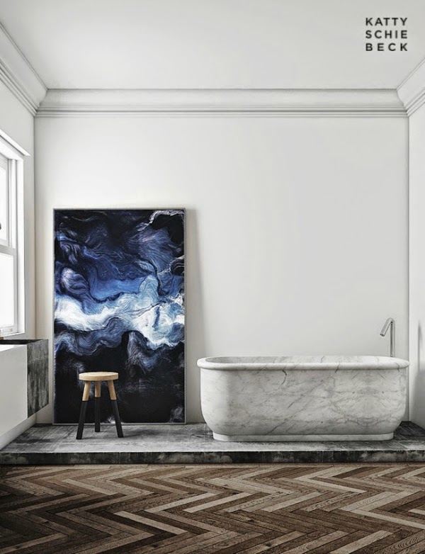
“We decided to highlight the bath as the most important element and we created a grade to highlight both elements even more, the bath and the
Andreas Nicolas Fischer painting.”
Thank you so much to Katty for telling us more about this wonderful project!



lovely project – love the [I think it is ] the bathroom sink
I love the pendant over the island. Would you mind telling me where you bought it?
Can you kindly tell me where to purchase this pendant? Thank you in advance.
Please contact Michael Anastassiades for more details. Link in text above. thanks
Can you inform me about the brand of the barstools or where to purchase them ? Many thanks.