The Swedish city of Uppsala is undergoing a lot of change at the moment. New constructions and residential areas opening all the time. This beautiful apartment building in the district of Falhagen, built by Genova Property Group, caught my eye. They have wisely teamed up with stylist Pella Hedeby to set the scene with her inimitable taste.
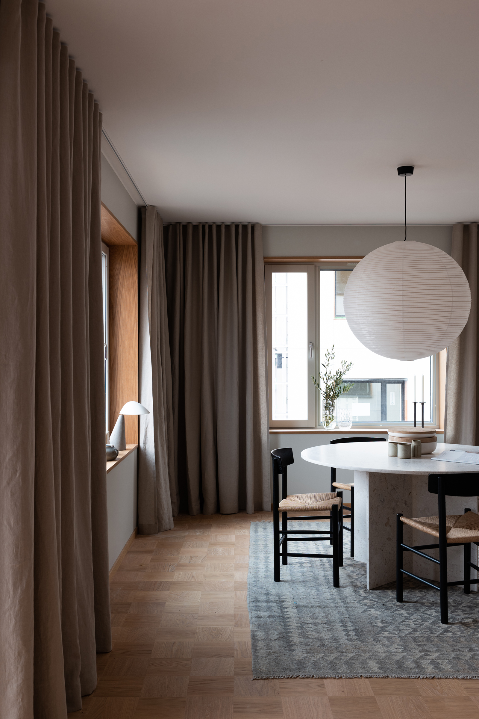
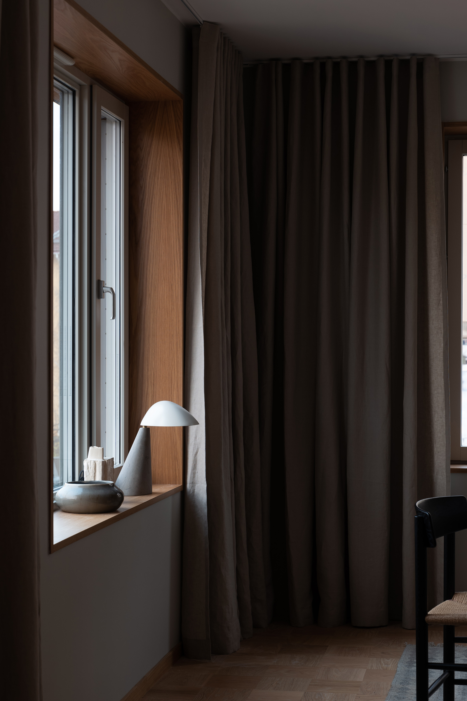
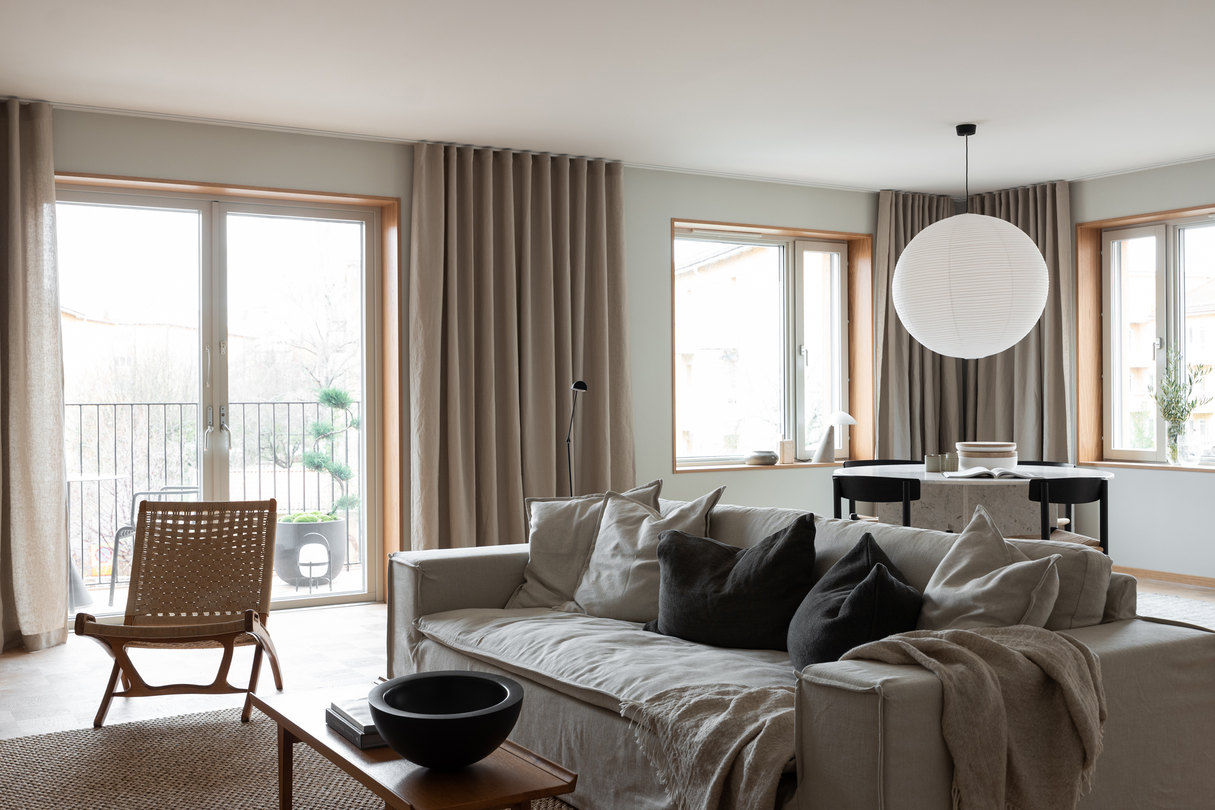
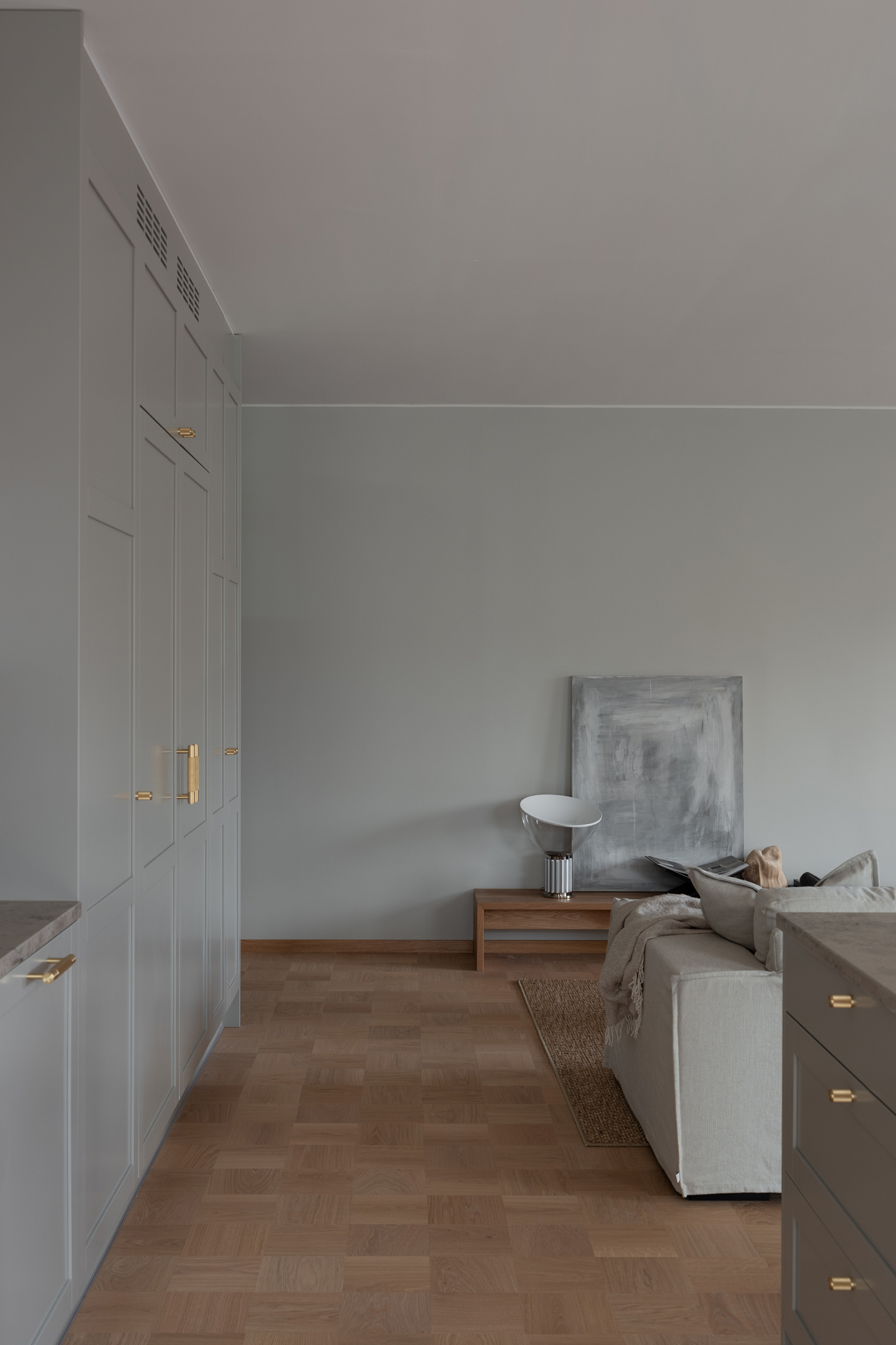
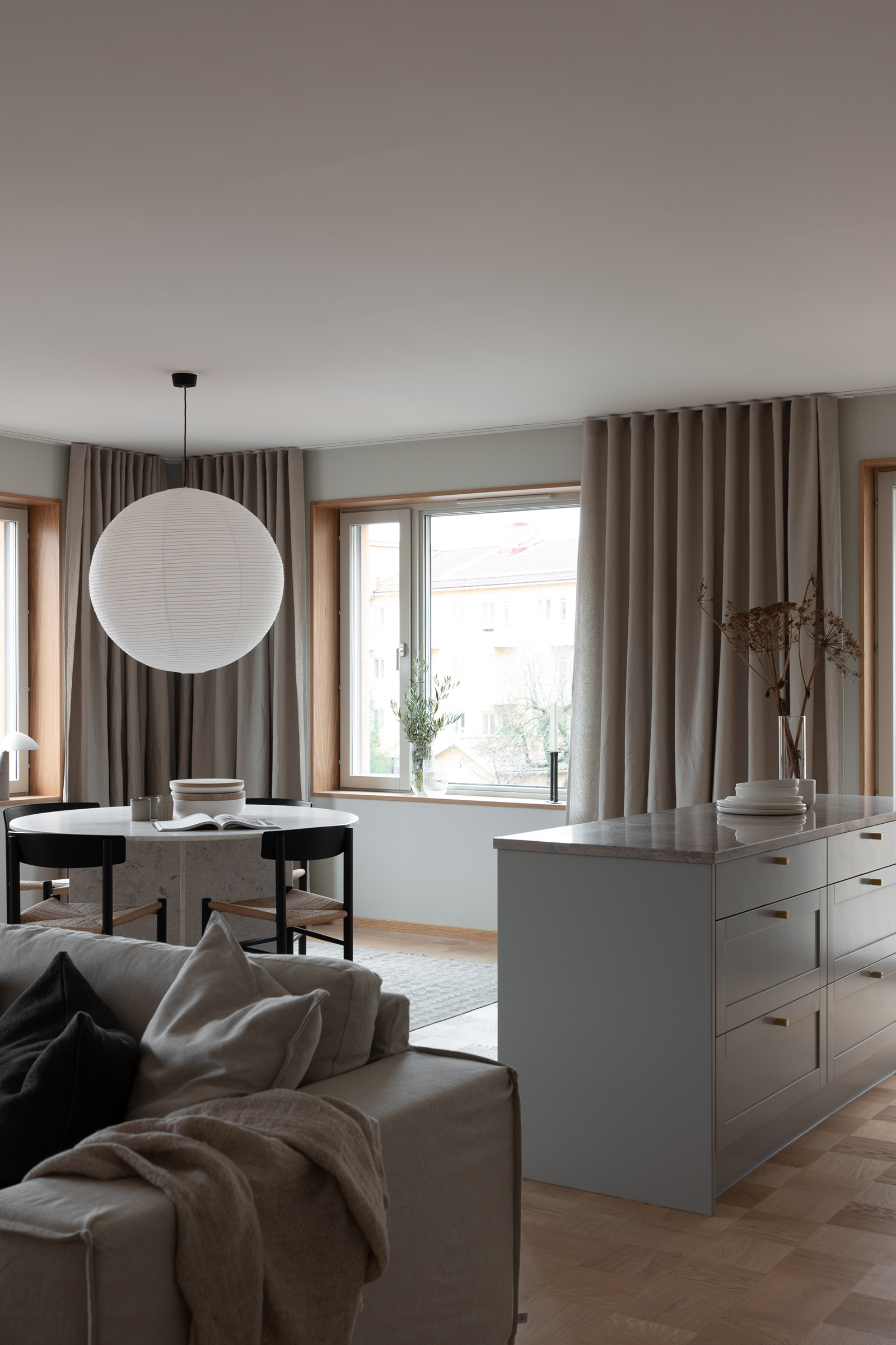
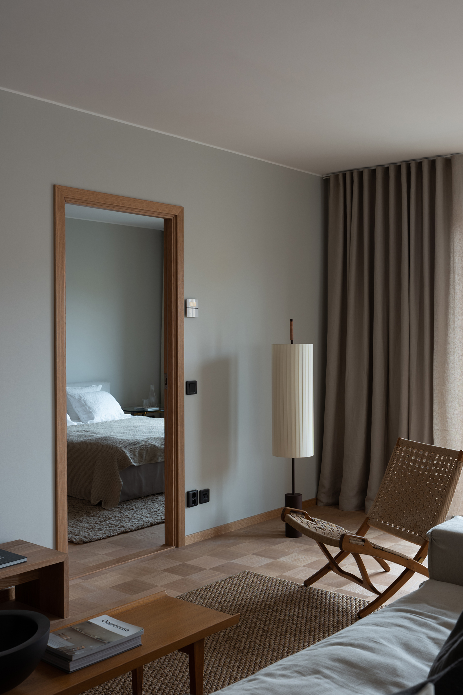
Each ‘Liljegatan 1’ residence is furnished with a base of warm oak parquet flooring, wooden details and a soothing, light colour palette throughout. It’s a look that’s both easy on the eye and totally Scandinavian.
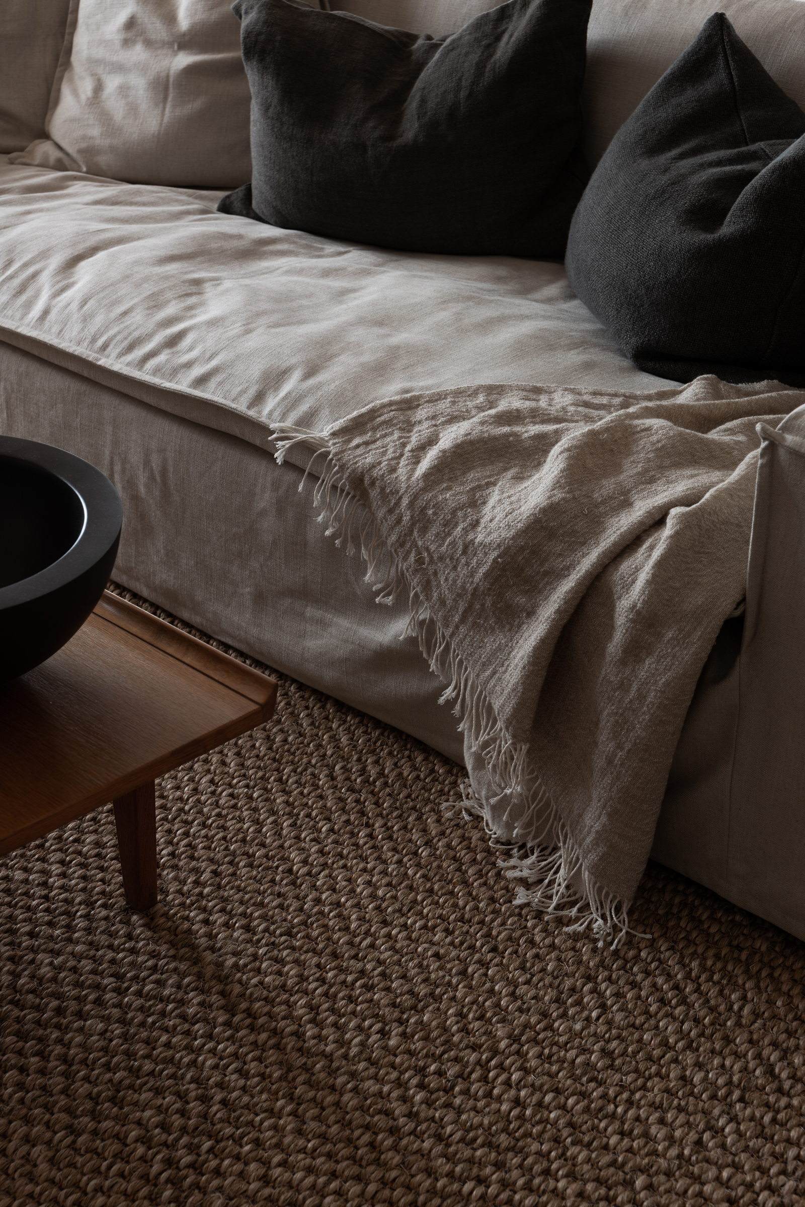
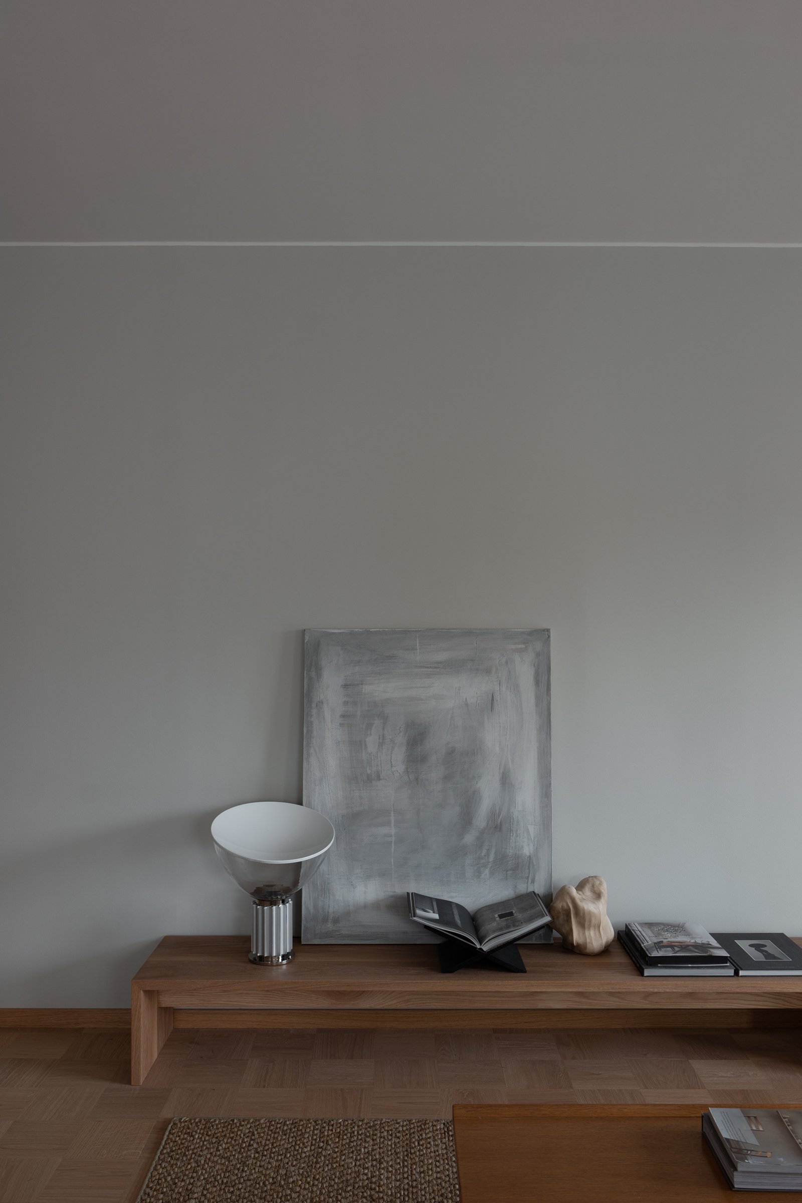
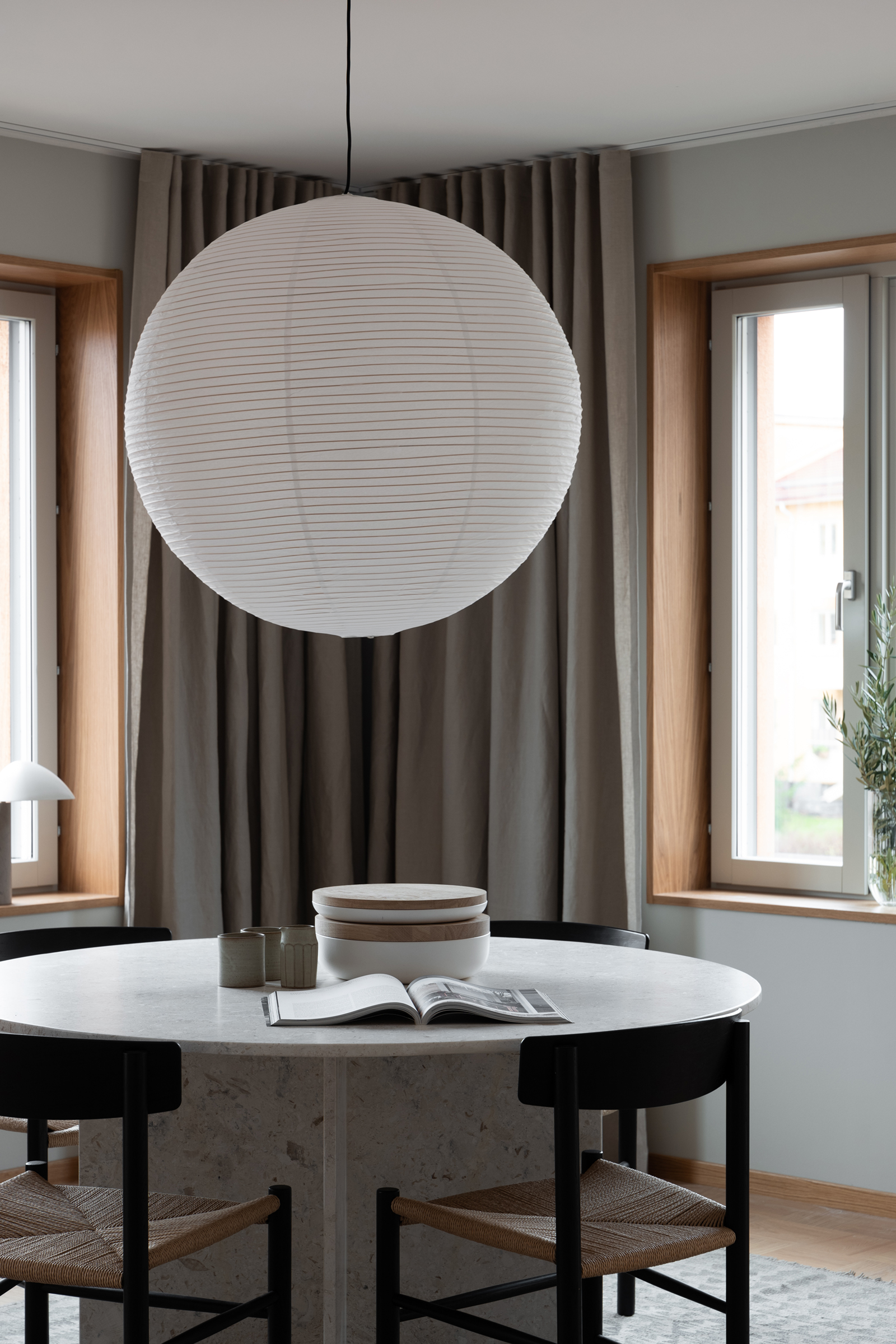
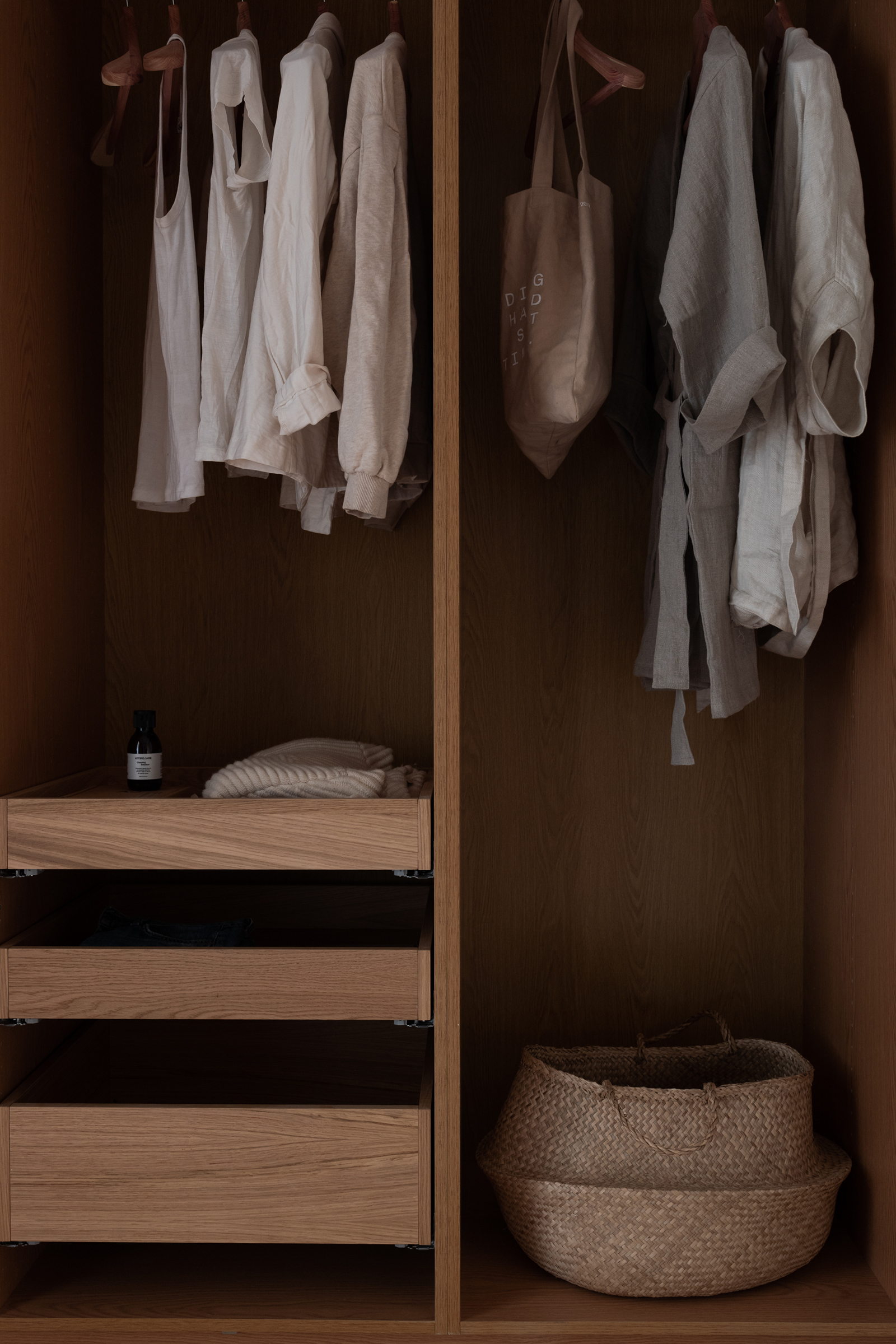
The open living space is made to feel effortlessly restful and light with a cosy linen sofa and warm beige curtains from Astrid. A dining area is carved out using a large flat woven rug to zone the table. Wooden trim around the window frames tie in tonally with the parquet floor and is echoed in the rattan upholstered furniture. I really love how Pella uses touches of black to cut through the neutral colours, like the J39 Mogensen dining room chairs and chunky bowl on the coffee table. Underfloor heating has also been installed to avoid hardware and radiators disrupting the visual flow of the spaces. I can’t help but spot the stunning Fellow lamp, designed by Space Copenhagen, from the recent Complements collection by Fredericia. You’ll also spot the Sequoia Pouf from the same beautiful collection in the walk in closet.
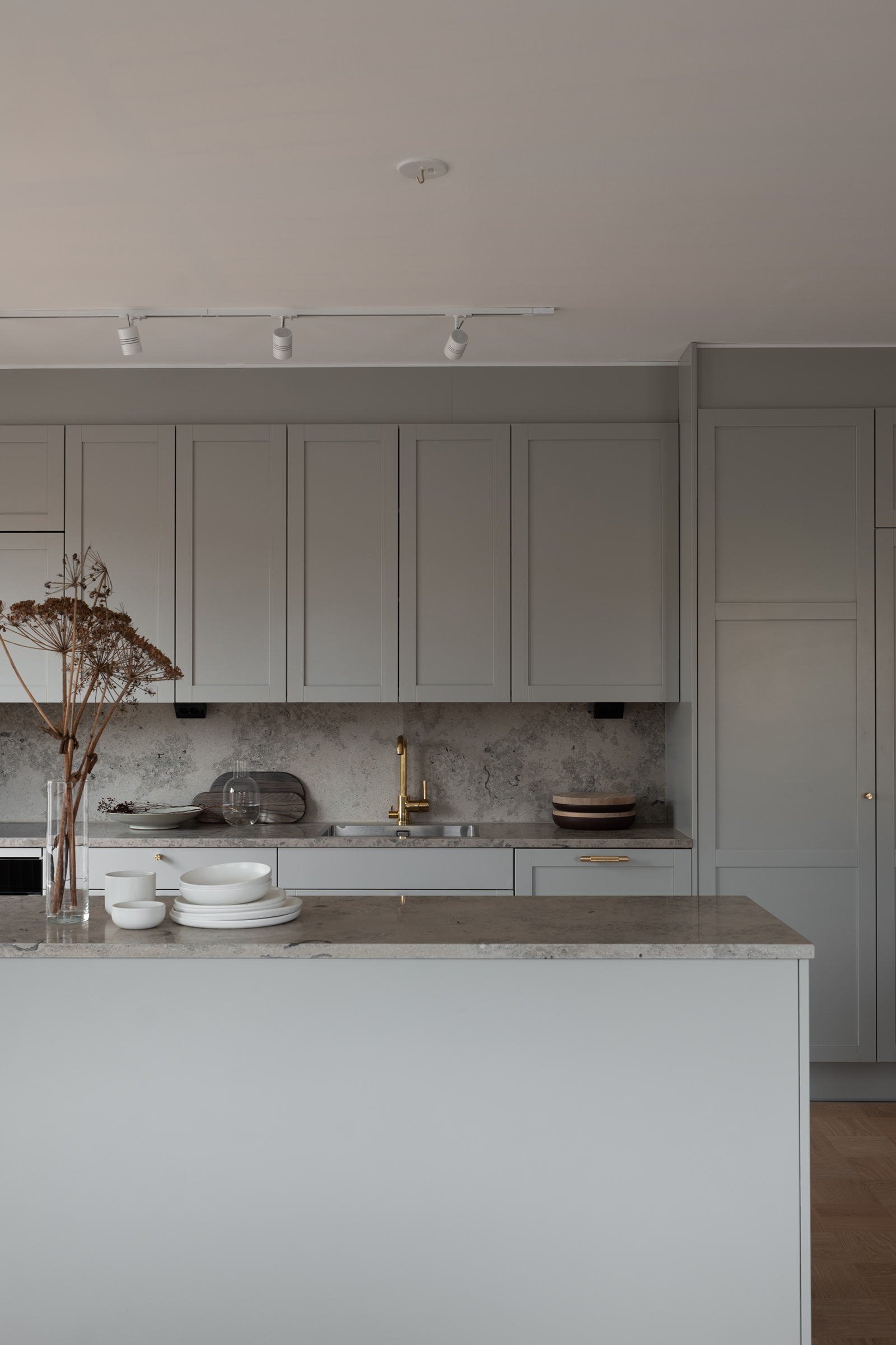
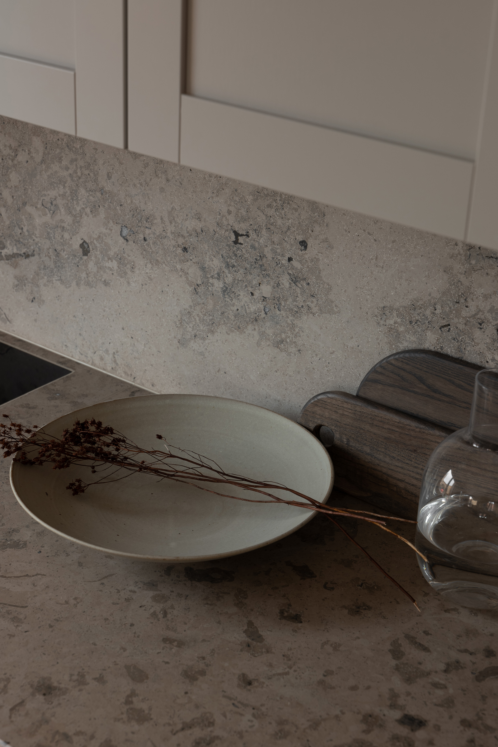
A spectacular kitchen shows off the craftsmanship in the warm grey cabinetry, finished with brass Buster + Punch handles. The worktops and splashback are made from a natural stone which lends tonal, visual interest to the space. A central island divides the open plan living space from the kitchen, becoming a place to store and display favourite tableware – these are from the Menu ‘Norm’ collection.
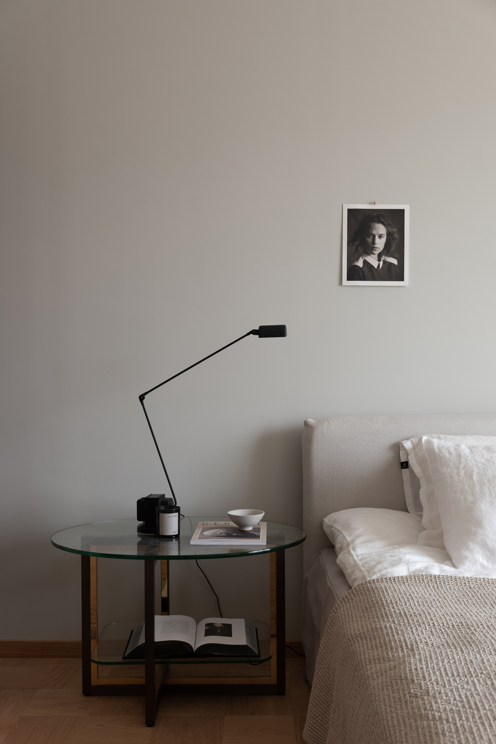
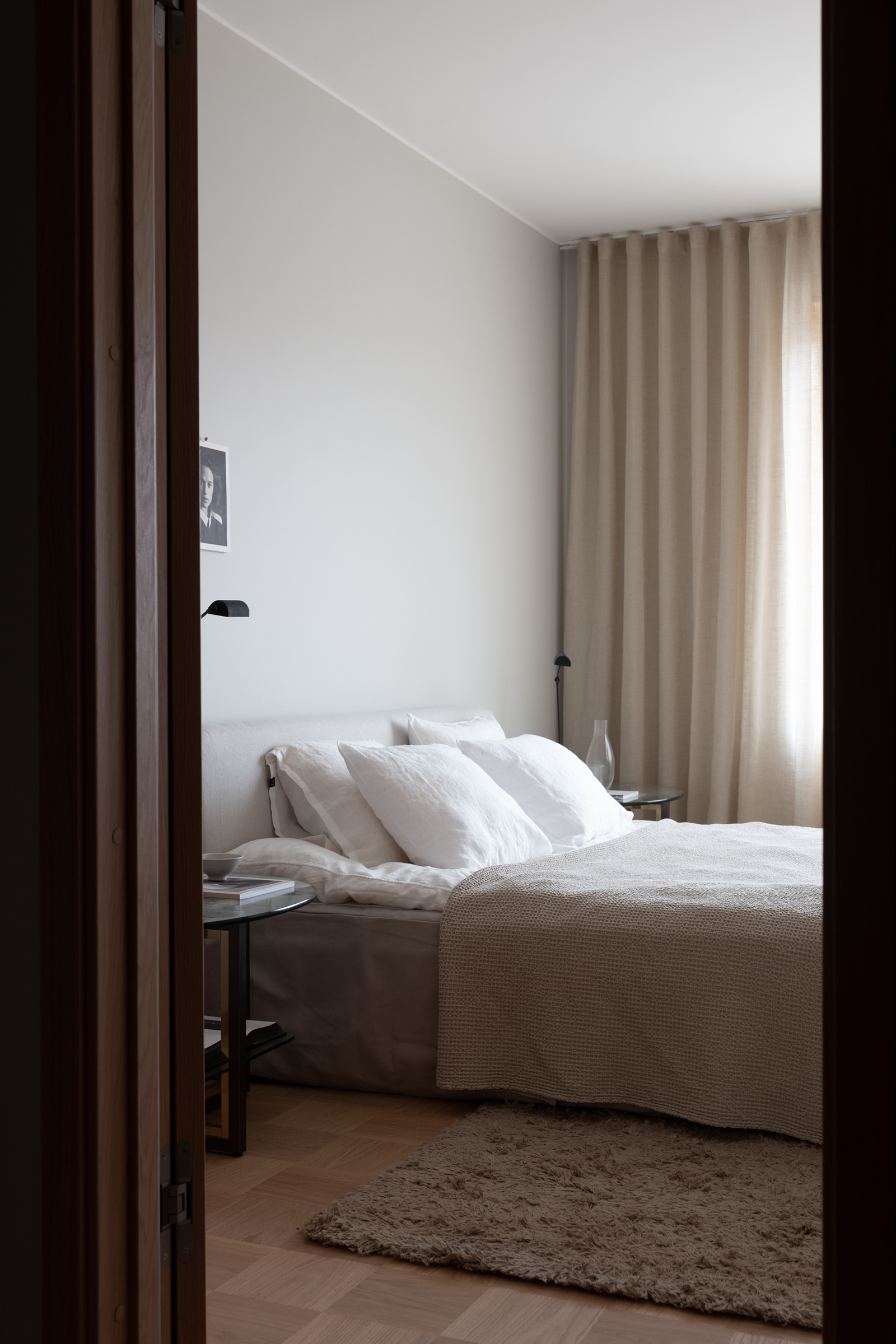
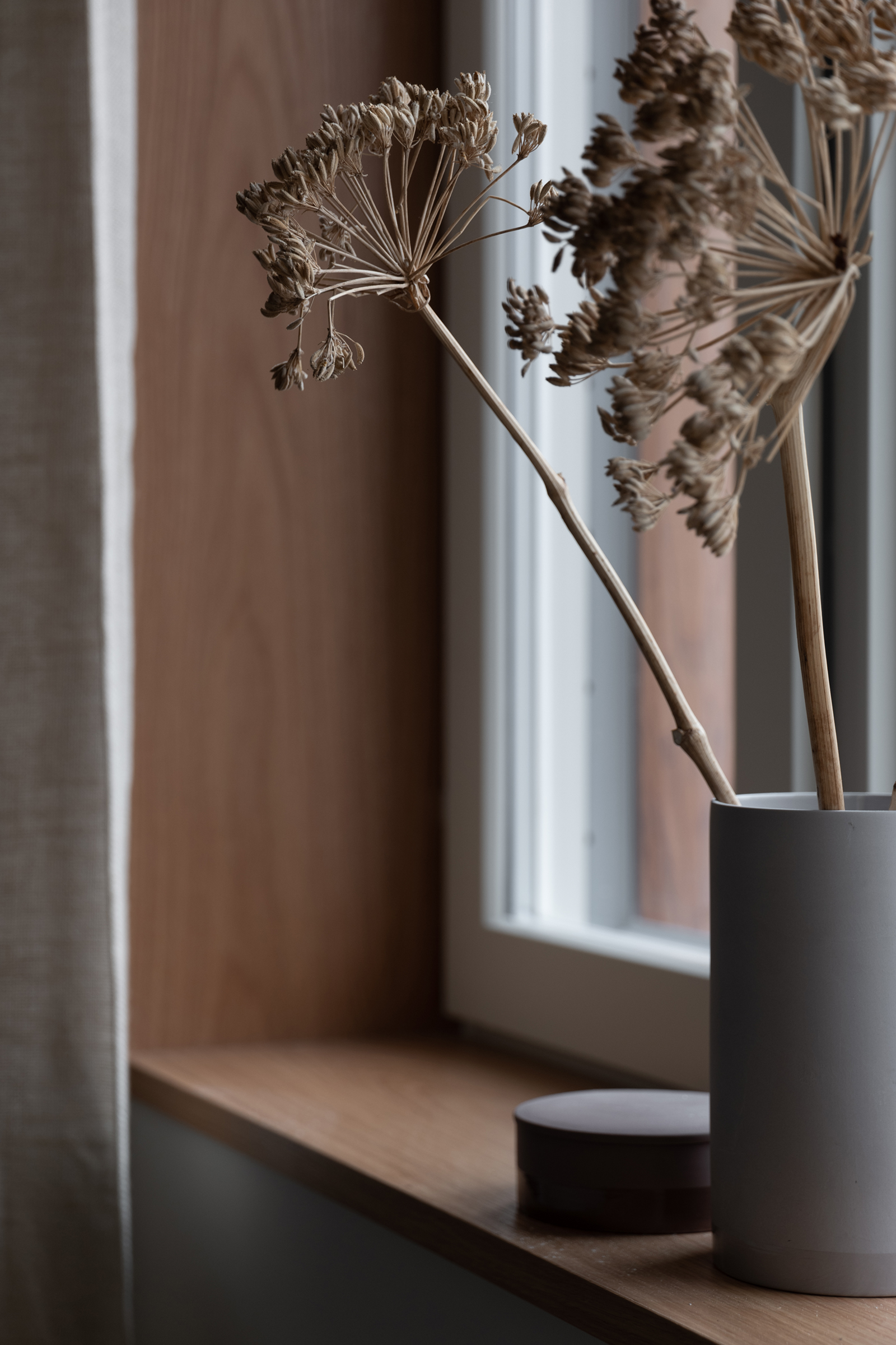
Simple arrangements of dried seed heads and olive branches connect you to nature, making what’s essentially a new build feel so comforting. Pella introduces crinkled linens, a deep pile rug in the bedroom and carefully curated artwork, design books and ceramics to make the apartment feel more artisanal. What do you think of the round glass coffee table used at the bedside? This is a great idea for a more unique look, particularly if you don’t want to be too matchy on both sides. And the thin lines of the black table lamp continues the contemporary, minimal look.
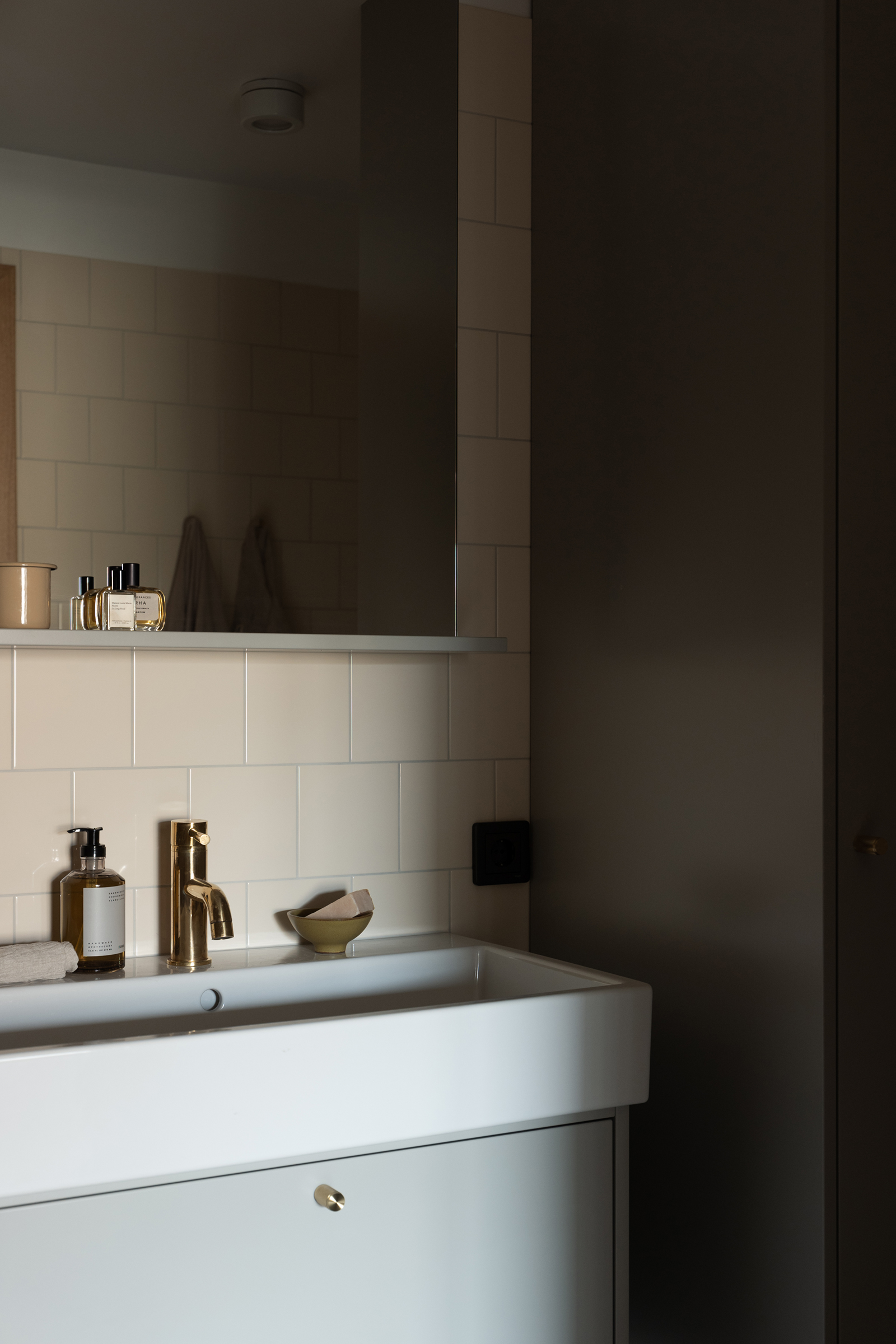
And the brass finishes continue into the bathroom with a gorgeous shower head set against beige toned square tiles and dark grey cabinetry.
With thanks to Genova Property Group. All photos are by @inredningsfotografen
I’m sure we’ll see much more from Genova in the future.