
Ochre and yellow are colours I couldn’t help noticing at London Design Fair this year. They were all over the place and it’s a colour I really like. I personally prefer ochre to bright yellow. When we moved to our new home we inherited velvet ochre curtains and I really like them. You can see them here. It’s a real 70s touch. There’s more 70s inspiration here if you like.
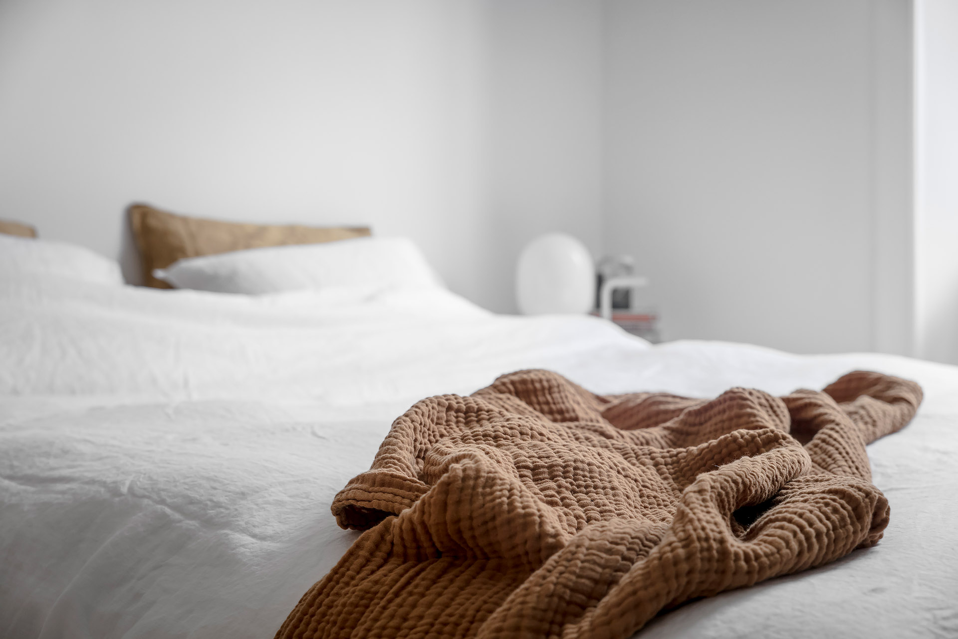
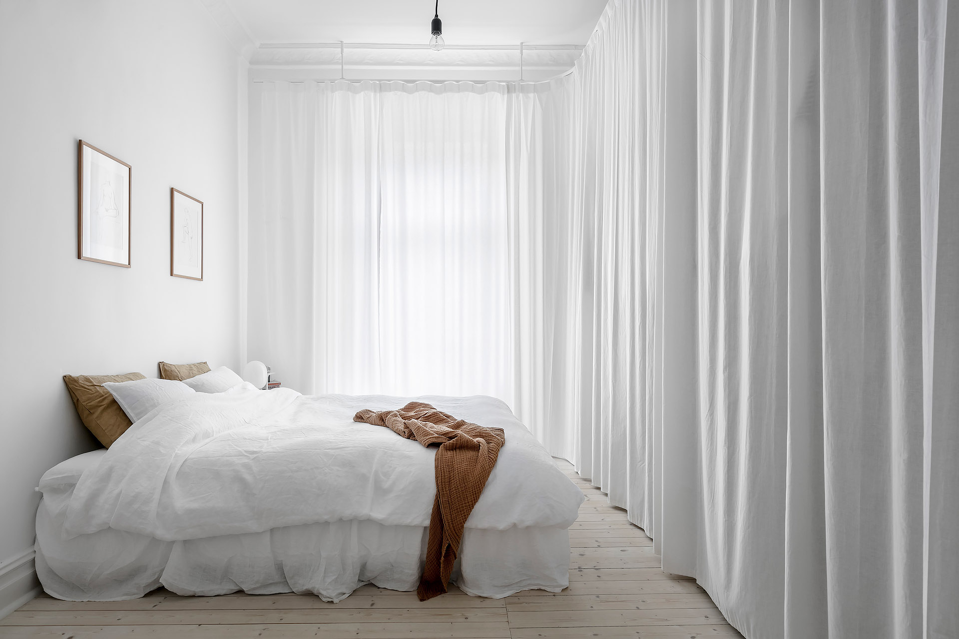
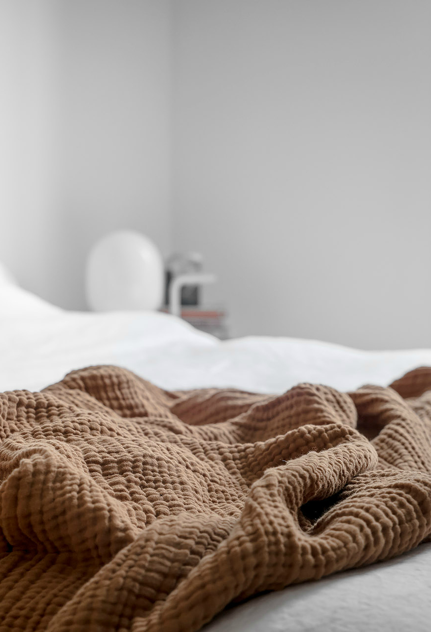
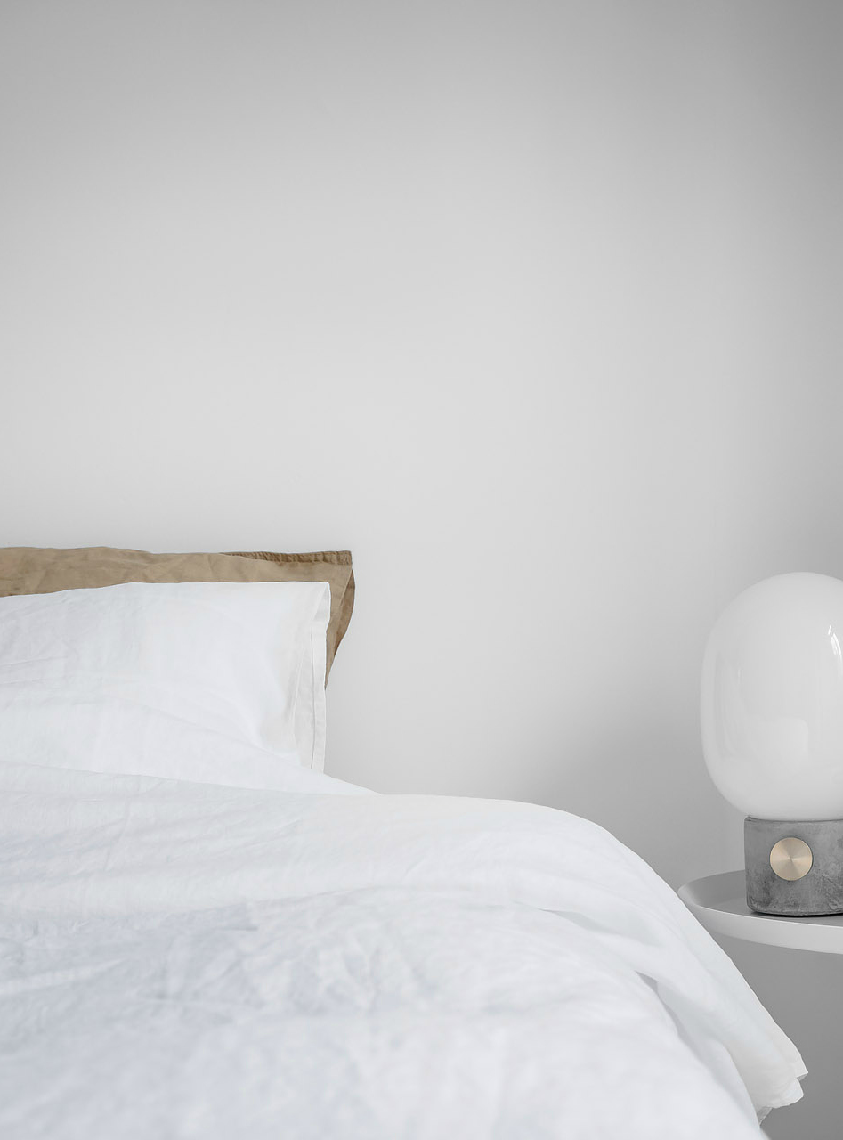
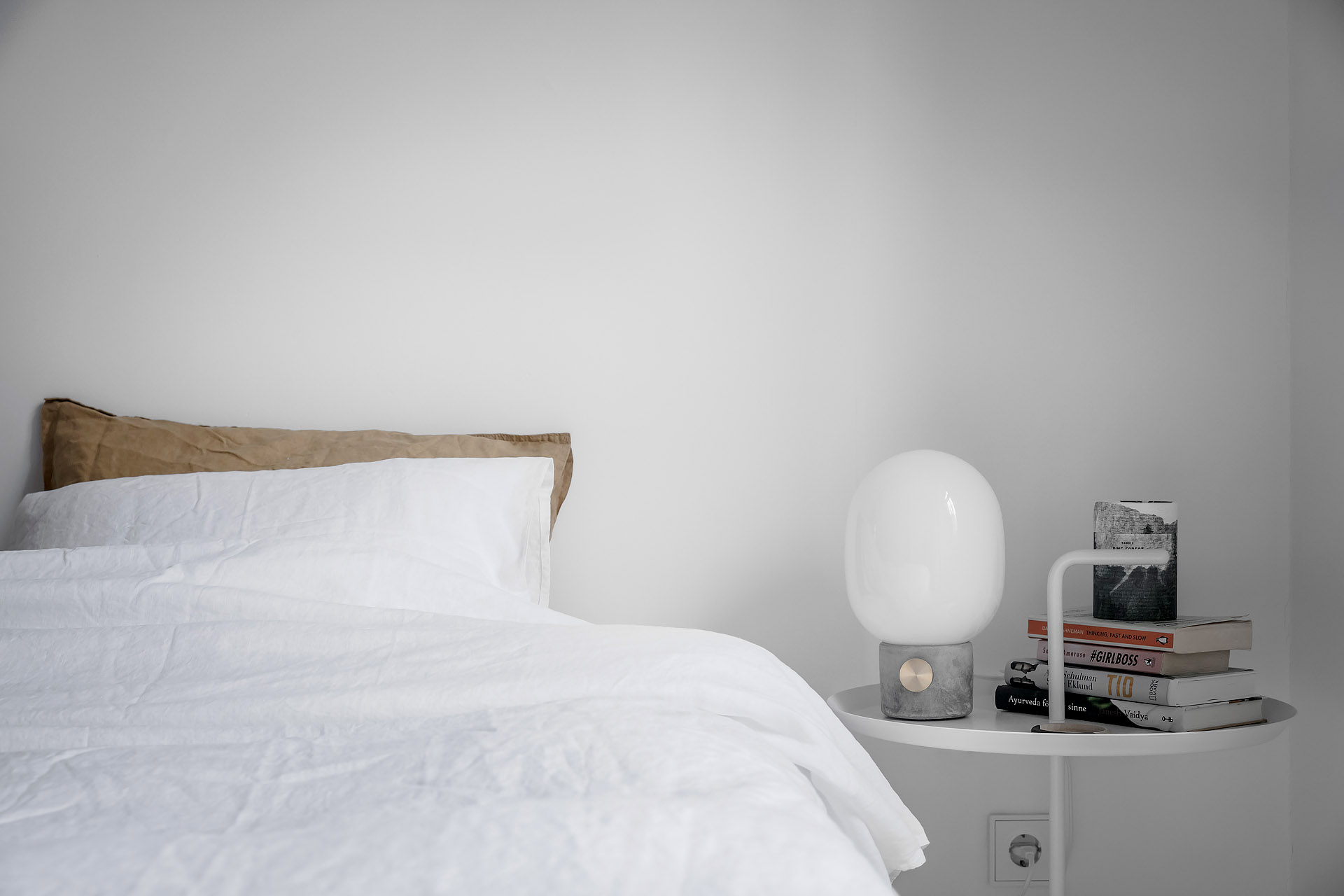
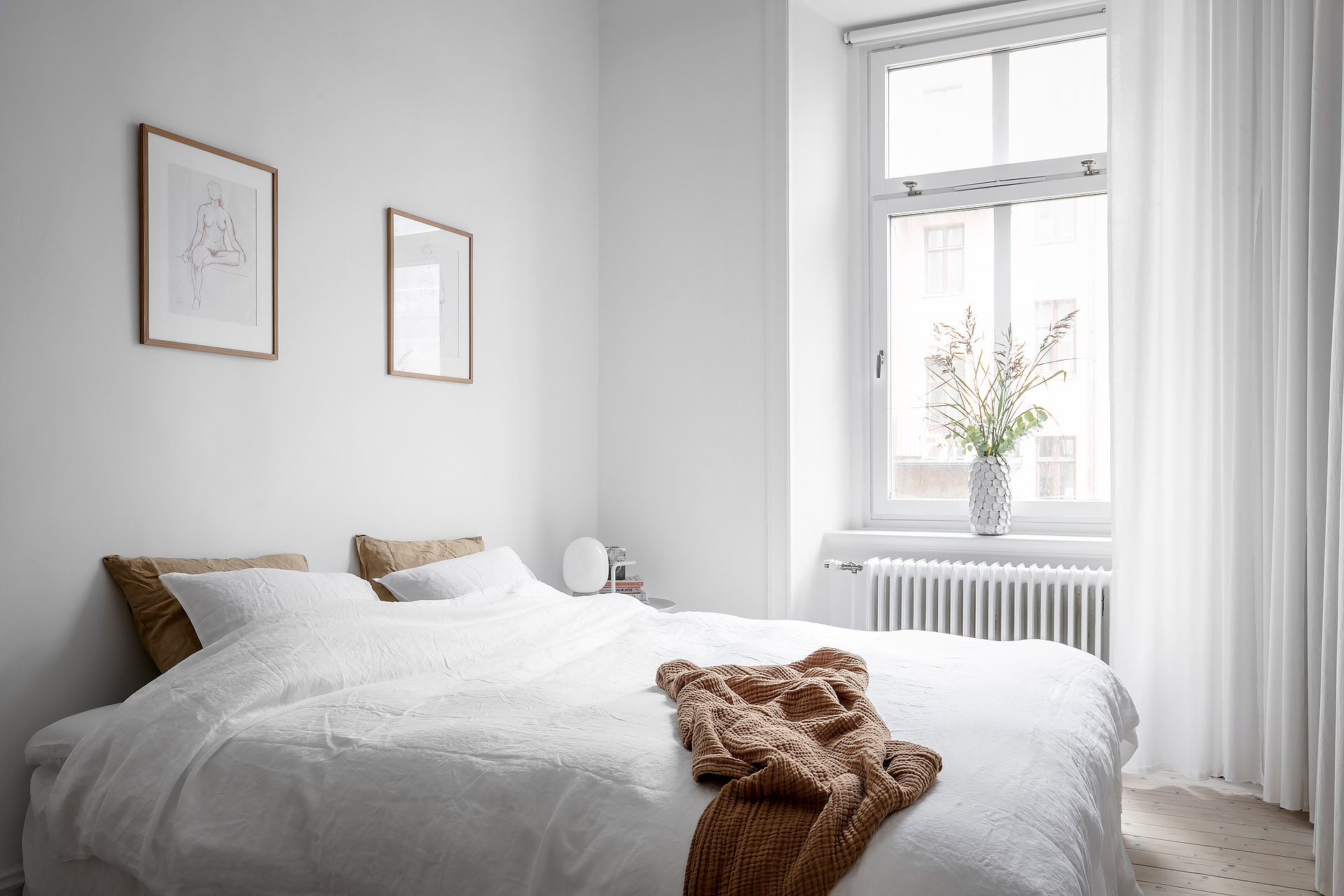
I noticed the touch of colour in this bright bedroom and wanted to share it with you. Mixing sheets and having a different colour of pillow cases isn’t something new, but I love the way the throw is the same colour in the pictures below. It works so well and the oak frames on the wall makes it all stand out against the white.
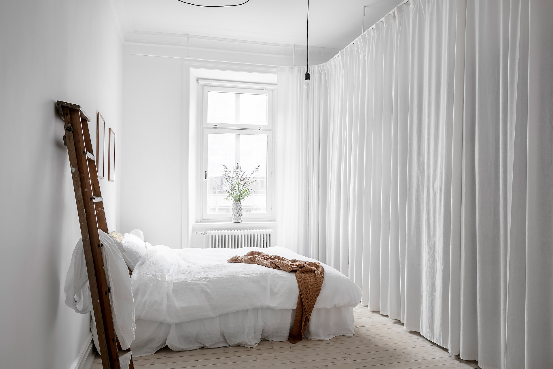
There’s something else I really like here too. The wall of curtains hiding the wardrobes. It’s a nice idea and very hotel like. It looks very dreamy, don’t you think?! I’m sure waking up here would be just fine.
All photos by Alvhem
If you’re like me and like simple line drawings, then have a look here at all the talented artists on Etsy. I’ve already blogged about two talented artists here and here if you want to see more black and white art.