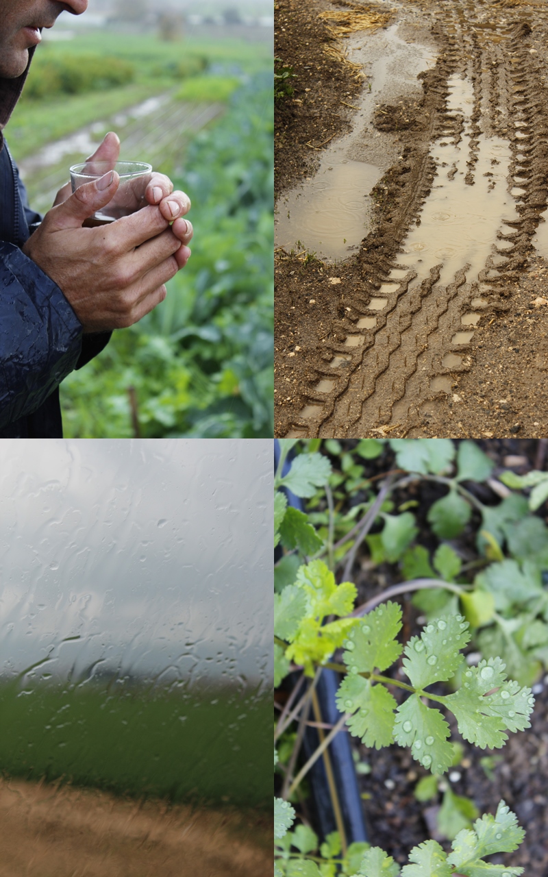
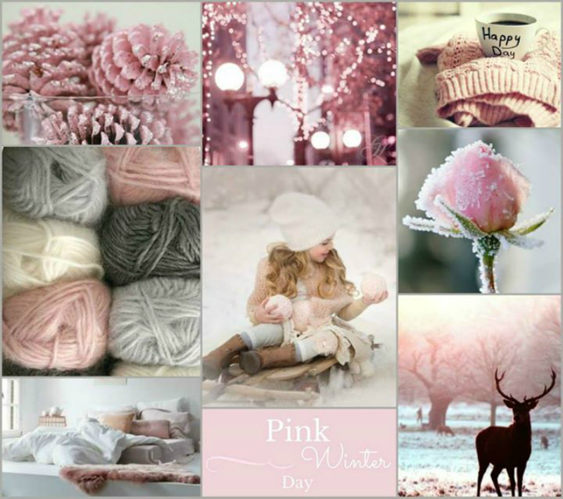
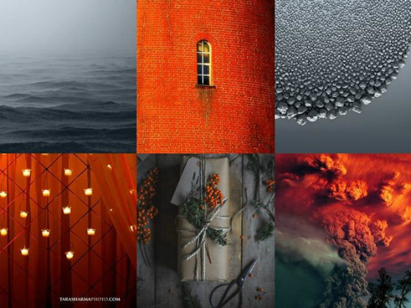
A while back my friend Efrat from Cafe Veyafe and I created a winter moodboard challenge. We now have the results. Our judge is lovely Gudy Herder from Eclectic Trends. She’s a moodboard expert and will later this Spring lauch a brand new on-line course. In the meantime you can sign up to her weekly newsletter here. Gudy knows all about colours and trends, so she was an obvious choice for judging this challenge.
Moodboard challenge Winners by Gudy Herder
Hi everybody!
I feel really honored to have been invited as a judge for this interesting challenge. Before I announce the winners let me briefly sum up the two main characteristic that had be given by Hege in France and Café Veyafe:
1. it’s a winter mood board
2. it shall convey a feeling or sense
Now, let me share with you my thoughts based on my experience as a teacher and user of moodboarding. I hope at the same time you might learn now a few tips & tricks.
My criterias for a well structured mood board and the requested features are the following:
TOPIC
All images shall relate to the picked topic guaranteeing by doing so a coherent overall wintery sense. Ask yourself, is this really an image that speaks about winter? If I show this pic to another person, will she/he immediately recognize my winter intention?
It’s not about putting randomnly pretty images together but tell a story! Moodboarding is always about telling a visual story and when well structured, really powerful.
The contest stated it had to evoke a sense or feeling as well which can easily be achieved by including images that evoke emotions.
VARIETY
Different disciplines included make it much more interesting.
Some examples would be images related to nature and winter sceneries, textures that evoke a winter feeling such as wool, mohair, etc. Food that stands for winter. Anything referring to the festive season.
COLORS
The color scheme can be wide if the images all talk winter only.
I don’ t recommend to use more than 3 primary colors but you could include additional shades within these (i.g.blue + light blue + teal)
GRAPHIC DESIGN
Working with colored borders is fine unless your framing is getting too much of an importance and overshaddows the general look&feel.
Make sure your the size of your image on one field corresponds to the importancee of the image in itself. Size matters. The bigger, the more eyecatching.
Numbering your images is great for crediting and very much valued, just make sure your numbers are not taking too much prominence.
TEXT
Text overlaying is fine and can add interest.
As a general suggestion, please make sure
· the typography font selected matches your story
· the text in itself makes sense being a winter story
STORY
Now, before I unveil the winning images let me tell you I had six images on my shortlist whe and it has been tricky to pick a finalist.
The winning image joins different criterias above mentioned such as good compositionning, clean and coherent color scheme, all images look winter related, etc.
But above all, this mood baord tells a little story and that’s when magic happens: we can say there is a sense or feeling.
AND THE 1ST PLACE WINNERS ARE…
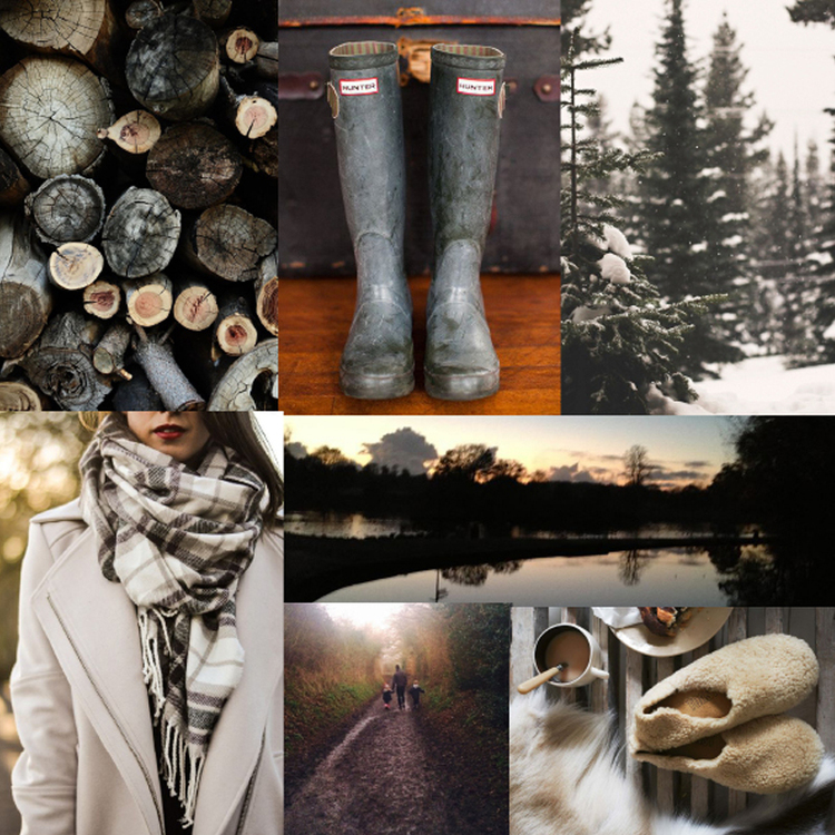
Congrats to Chloe Dunne Design (Hege’s reader)
And this is the story I am reading here: it’s about a family with two little kids. They live in the country side and spend time until the sunset on winter walks. When coming home, there is a fire place to keep them warm and cosy with nice food and a warm cup of coffee.
Congrats to StuDolev (Efrat’s reader)
Thank you all for taking part in our moodboard challenge and a huge thank you to all our sponsors; Habayta, Tema shop, Avitalos, Pudish, Petek Design, Ferm Living, Bodie and Fou, Bloomingville, Buba Bella, Something New, Layla Loop, Yooletta and Gugu design.
Thank you Efrat and Gudy! x


